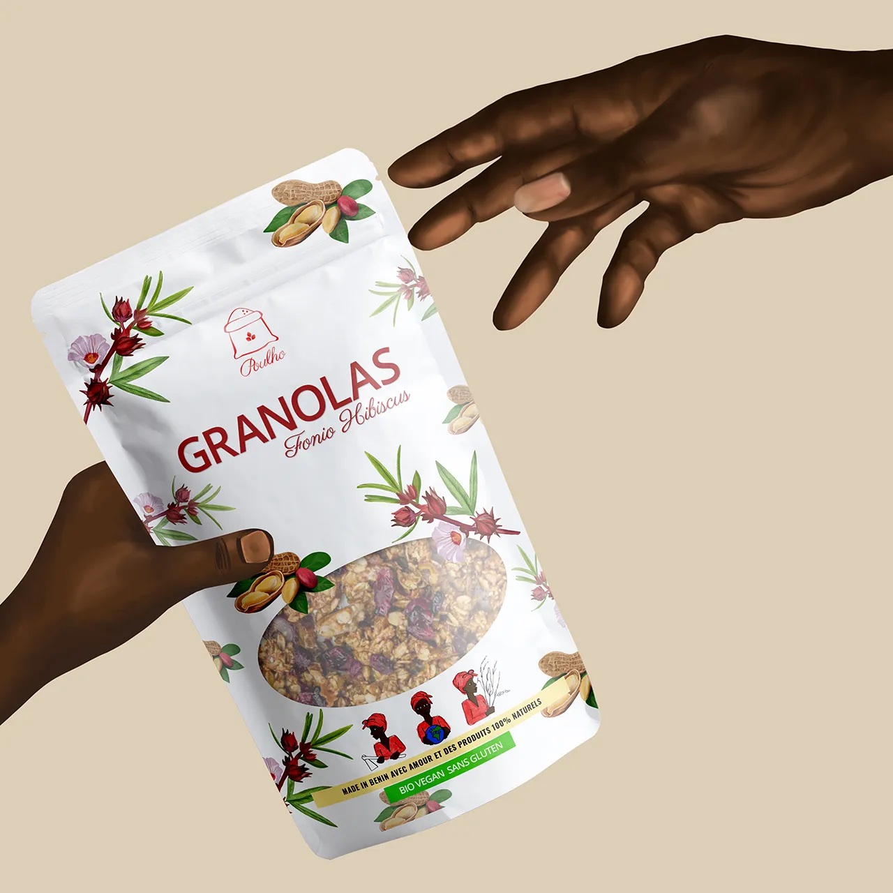


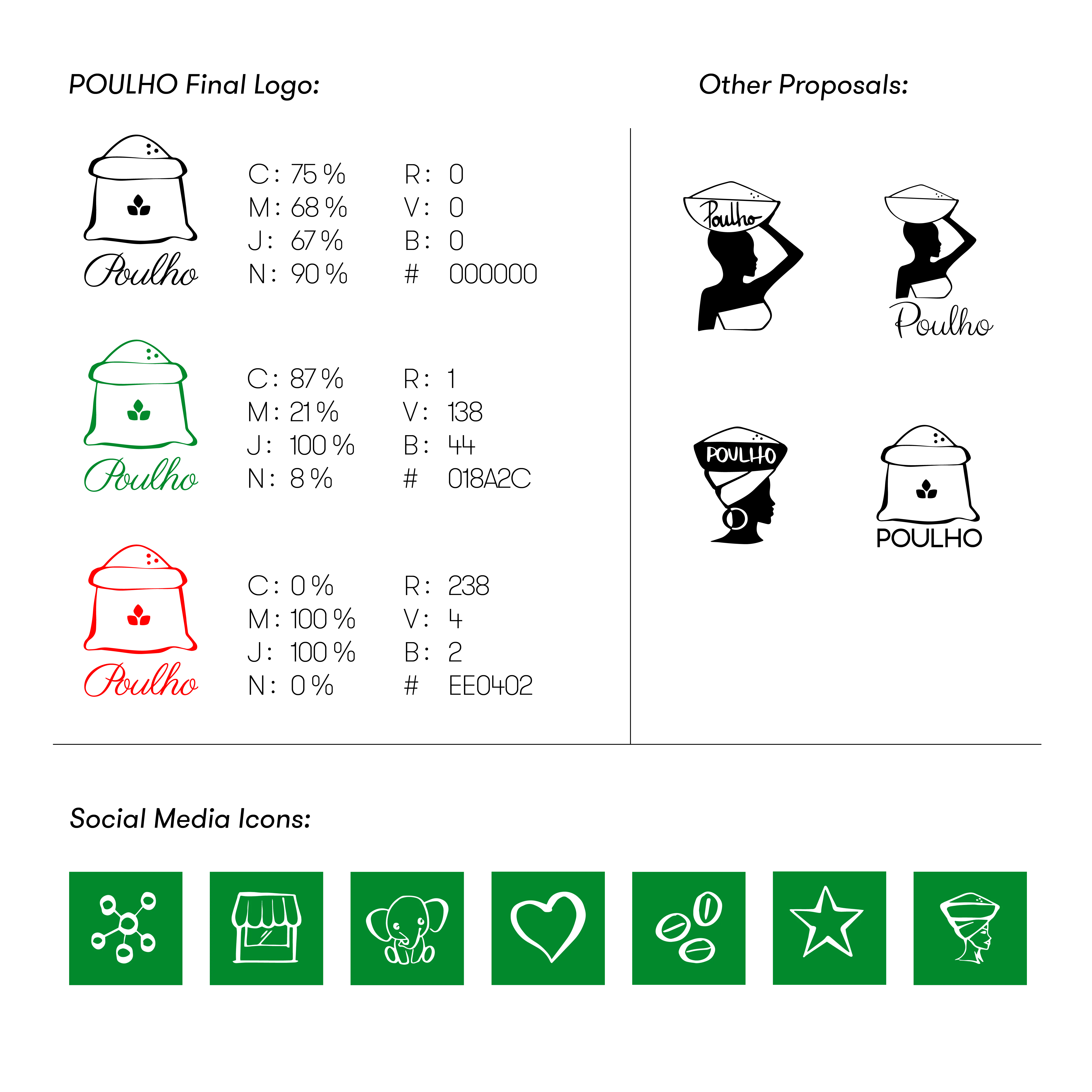
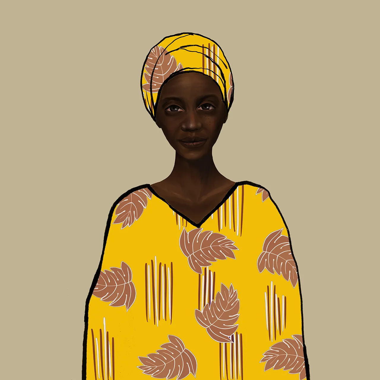
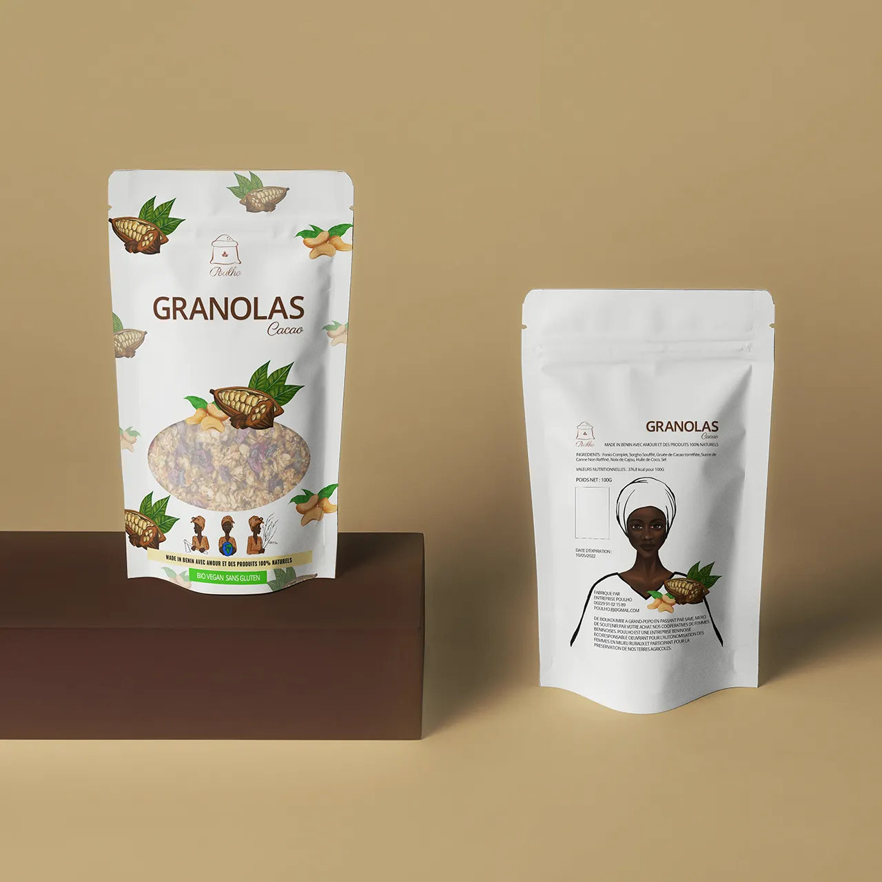
POULHO means "woman" in Fon, a local language spoken in Benin.
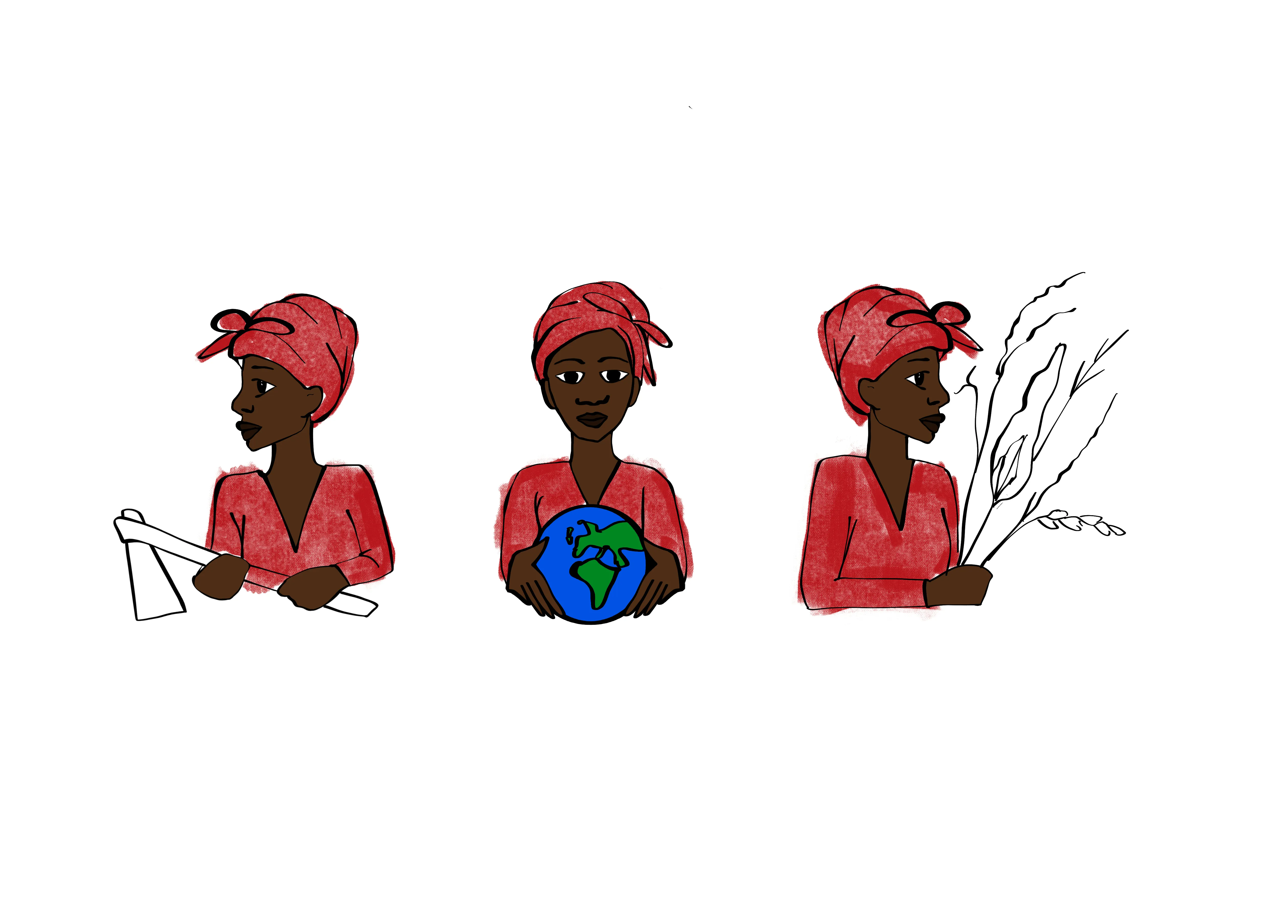
That name alone felt like a brief: this wasn’t just about granola — it was about storytelling, visibility, identity. A celebration of the women who grow, gather, and prepare the ingredients, and a bridge between tradition and contemporary culture.
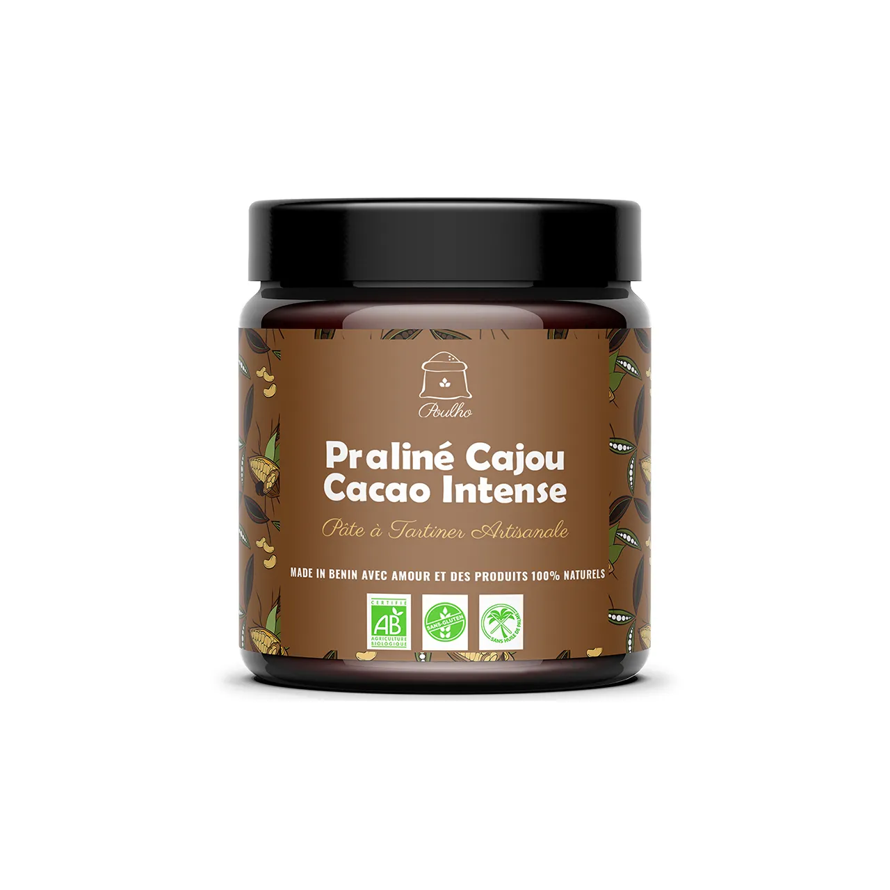
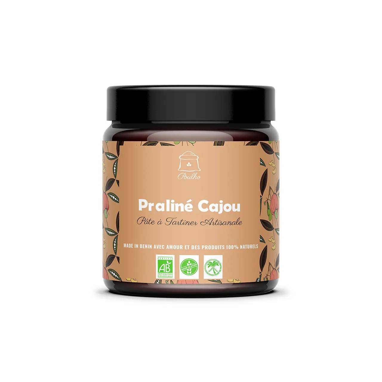
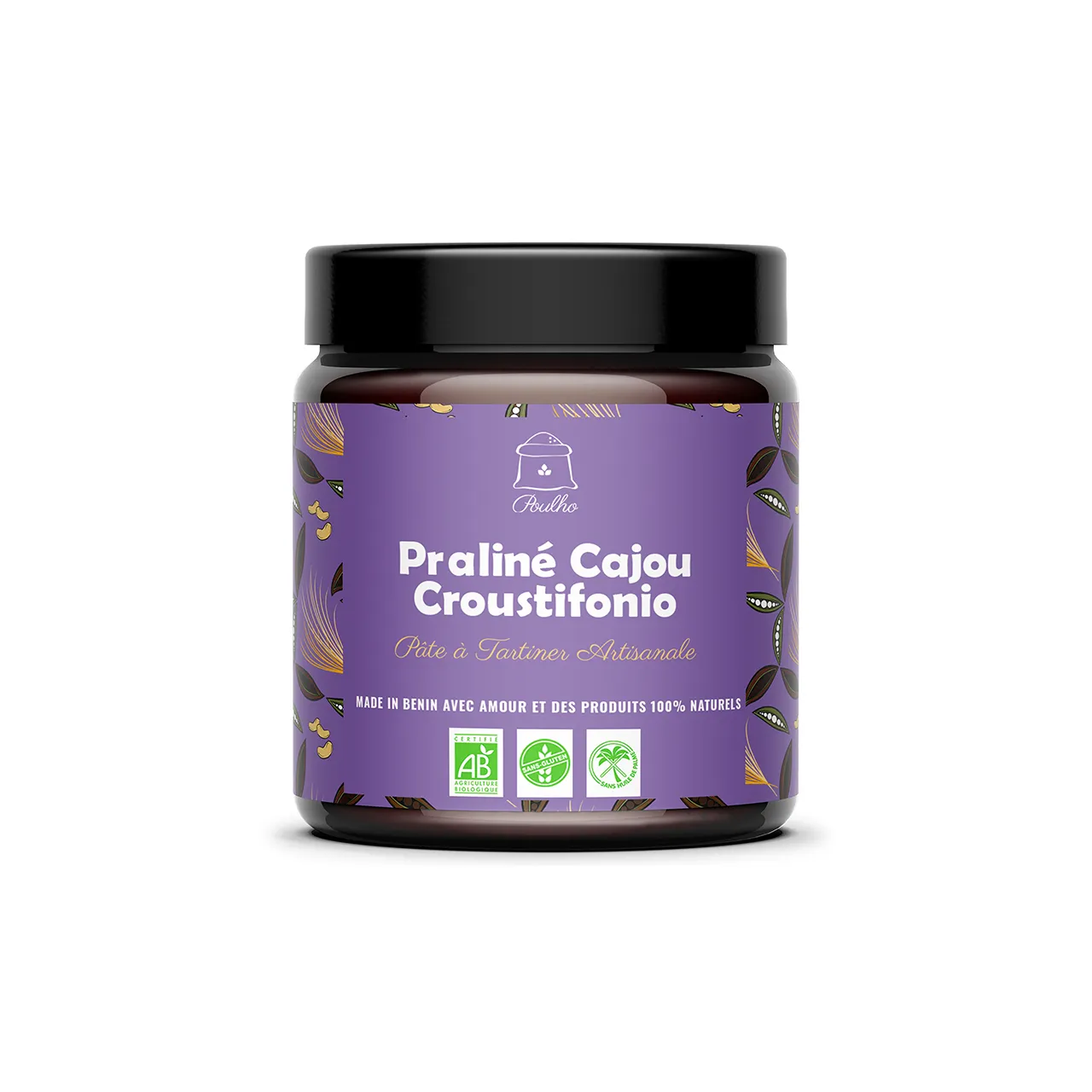
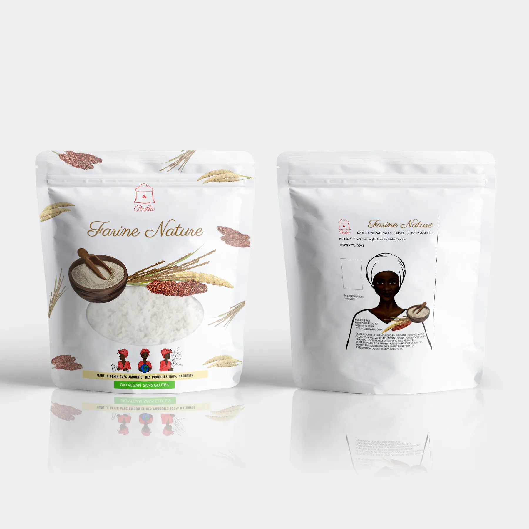
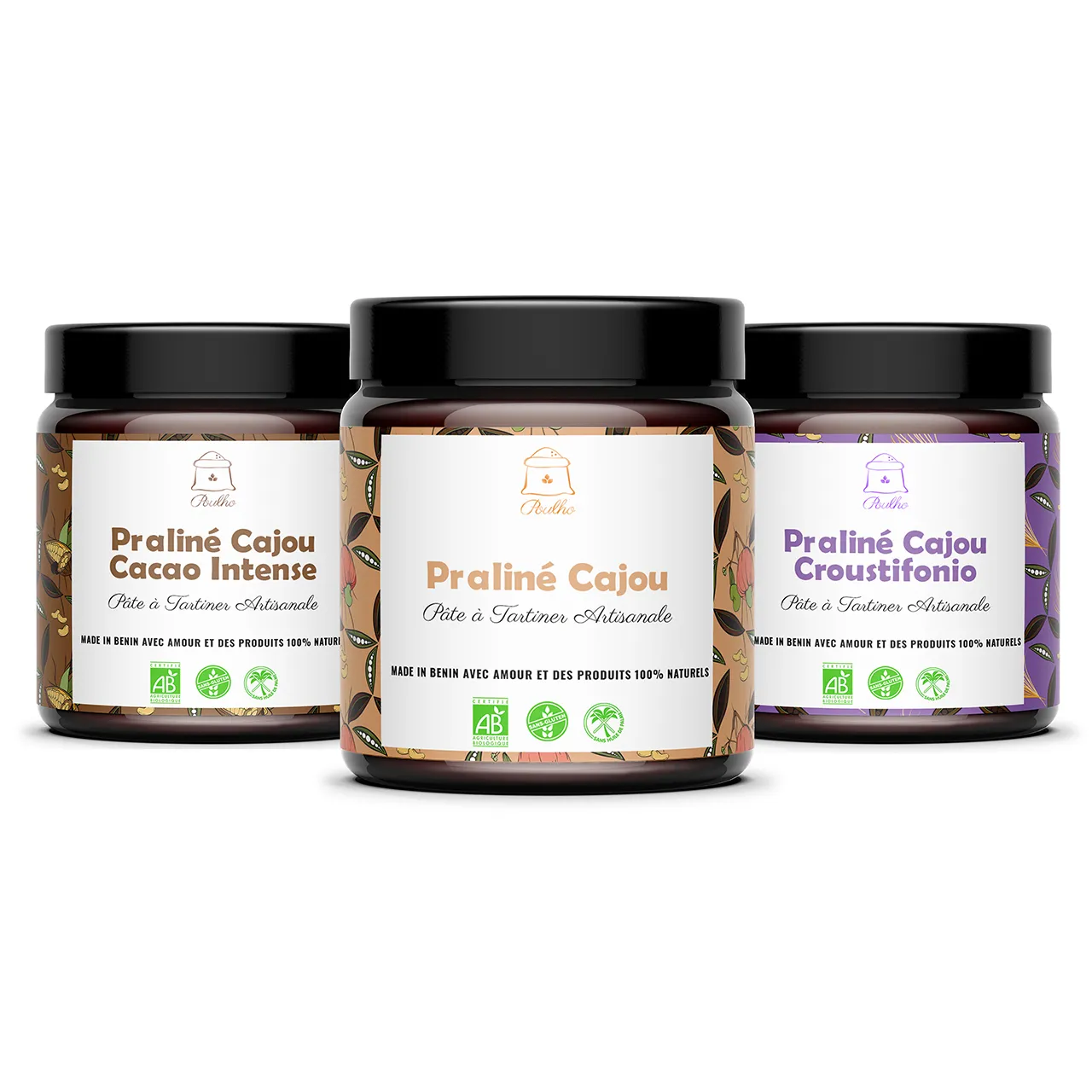
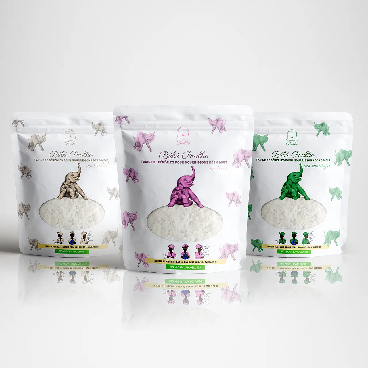
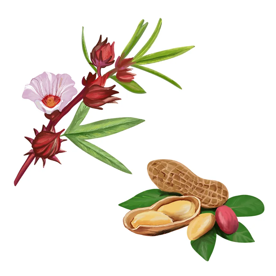
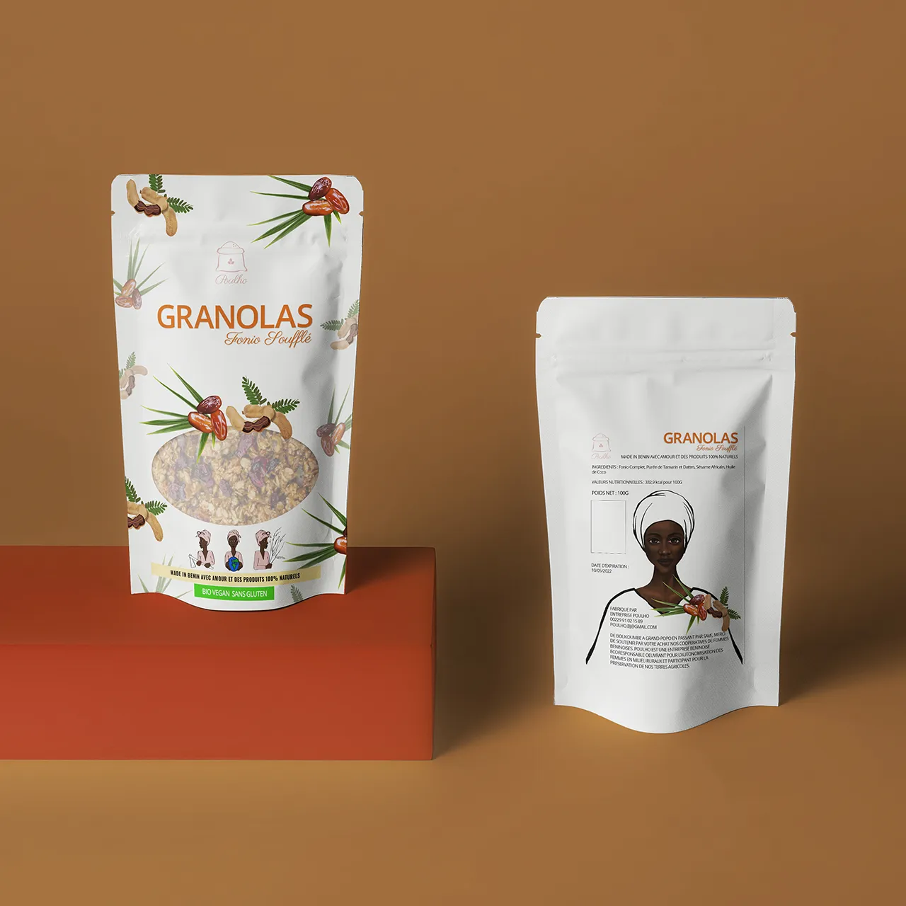
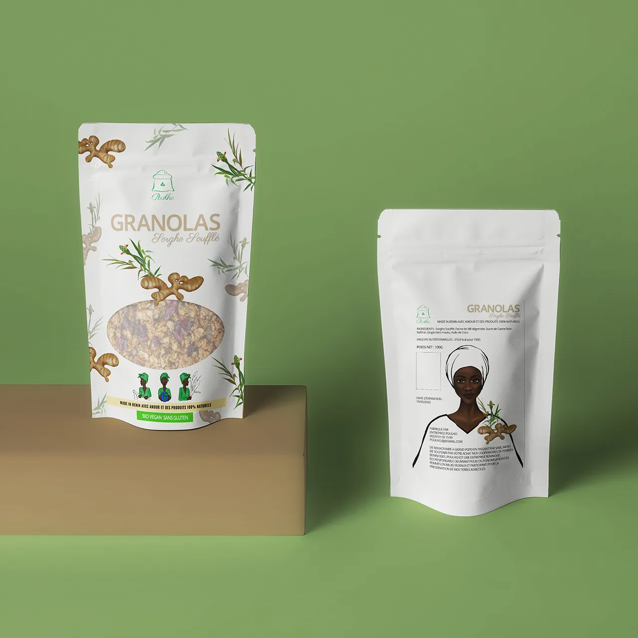
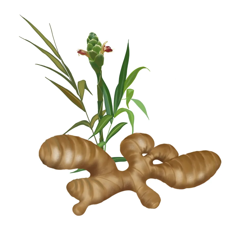
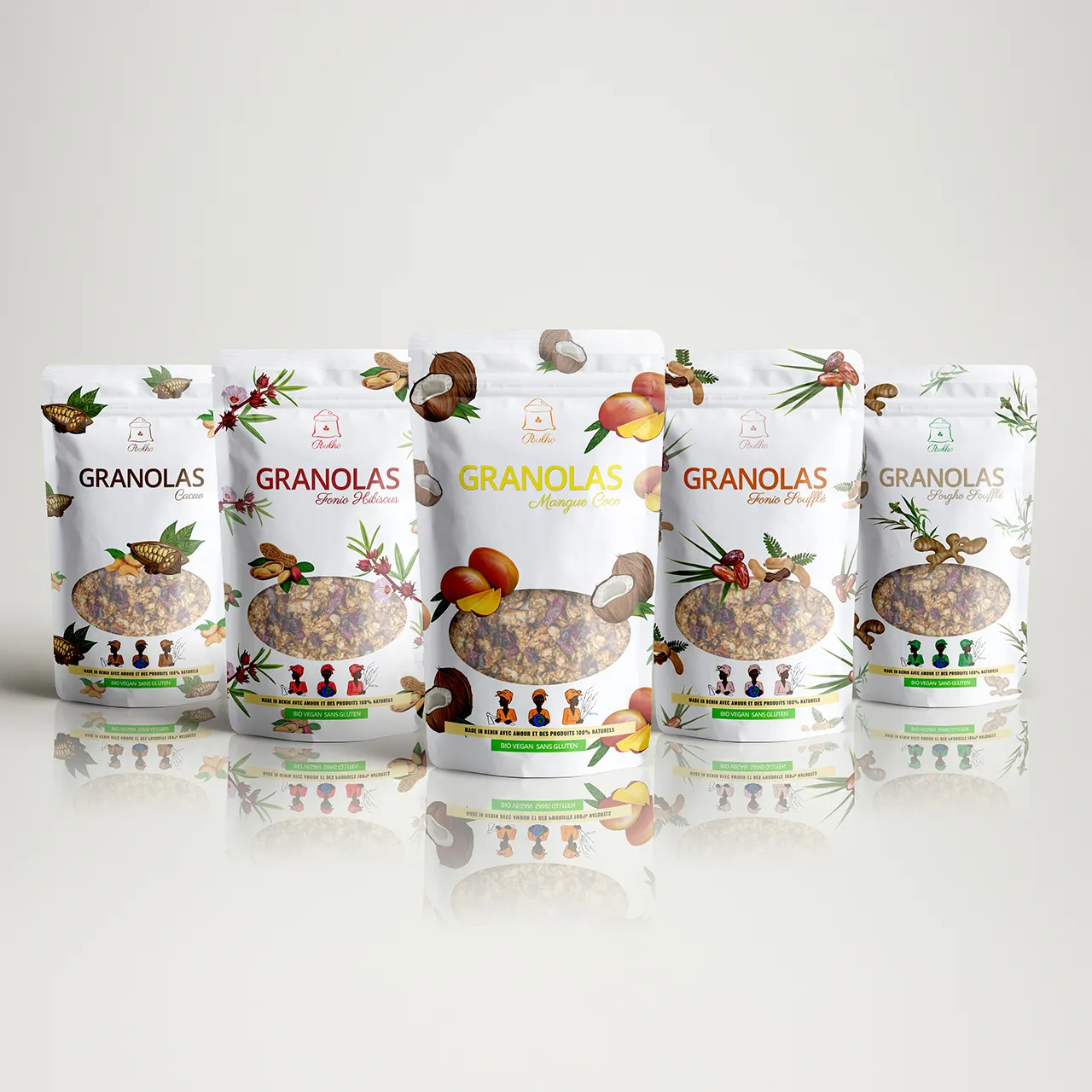
The brand wanted to bring a range of gluten-free cereals (based on fonio, millet and sorghum) to the French market — healthy, locally grown, and crafted by women’s cooperatives in Benin. What they needed was a visual identity that would honor this origin, speak to a younger and health-conscious audience, and stand out in the crowded world of "green & good."


While their values were clear — sustainability, feminism, natural food — their positioning still needed definition. So I asked questions:
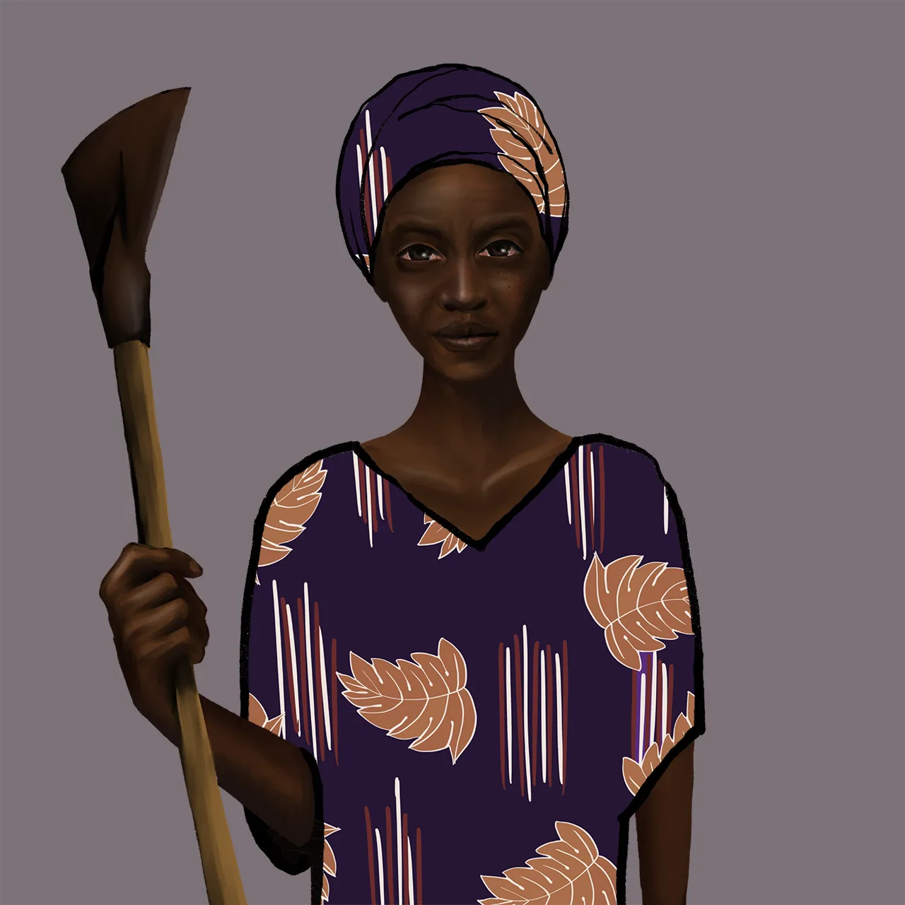
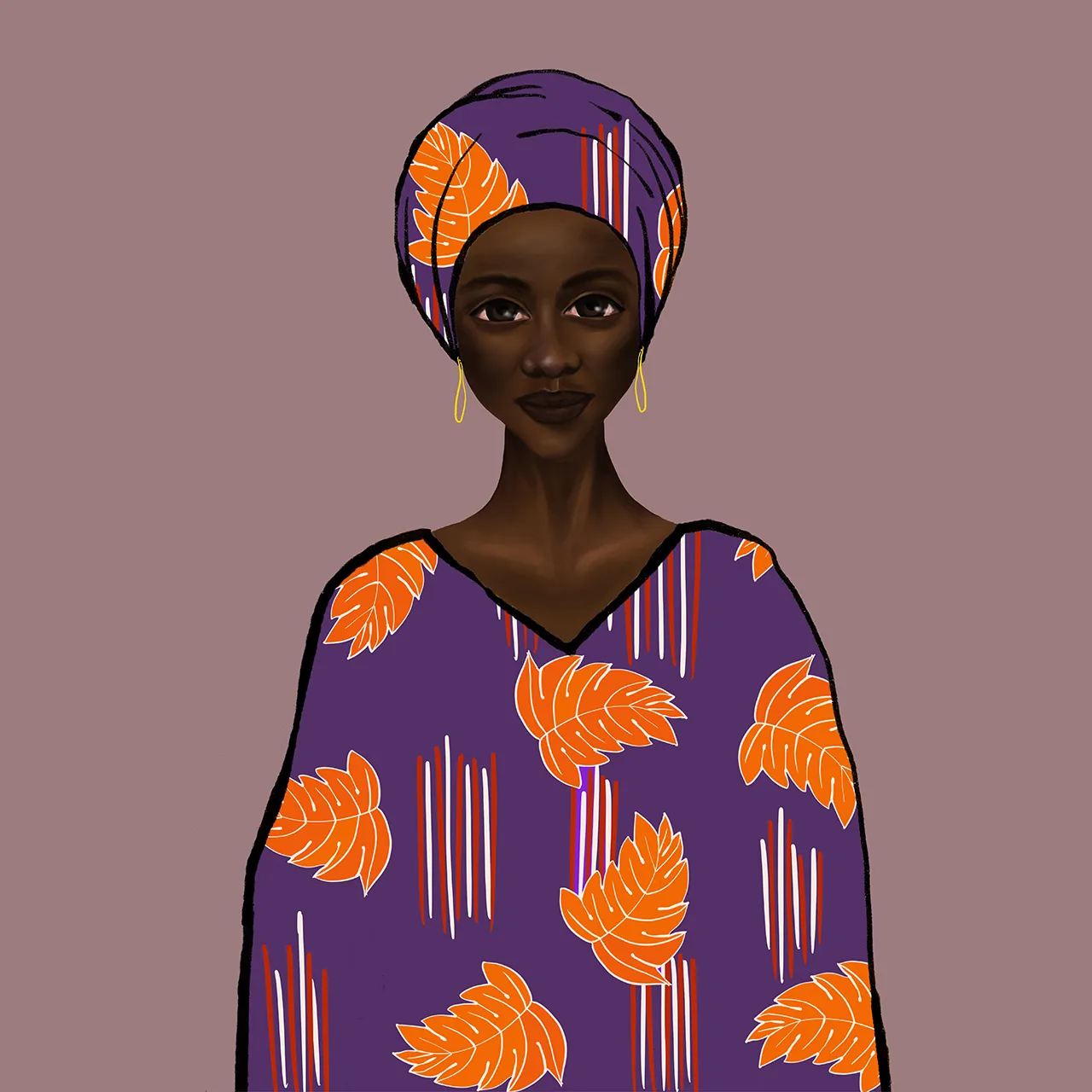
Who is the heroine behind this brand?
What does she sound like?
Where does she stand on the shelf, and next to whom?
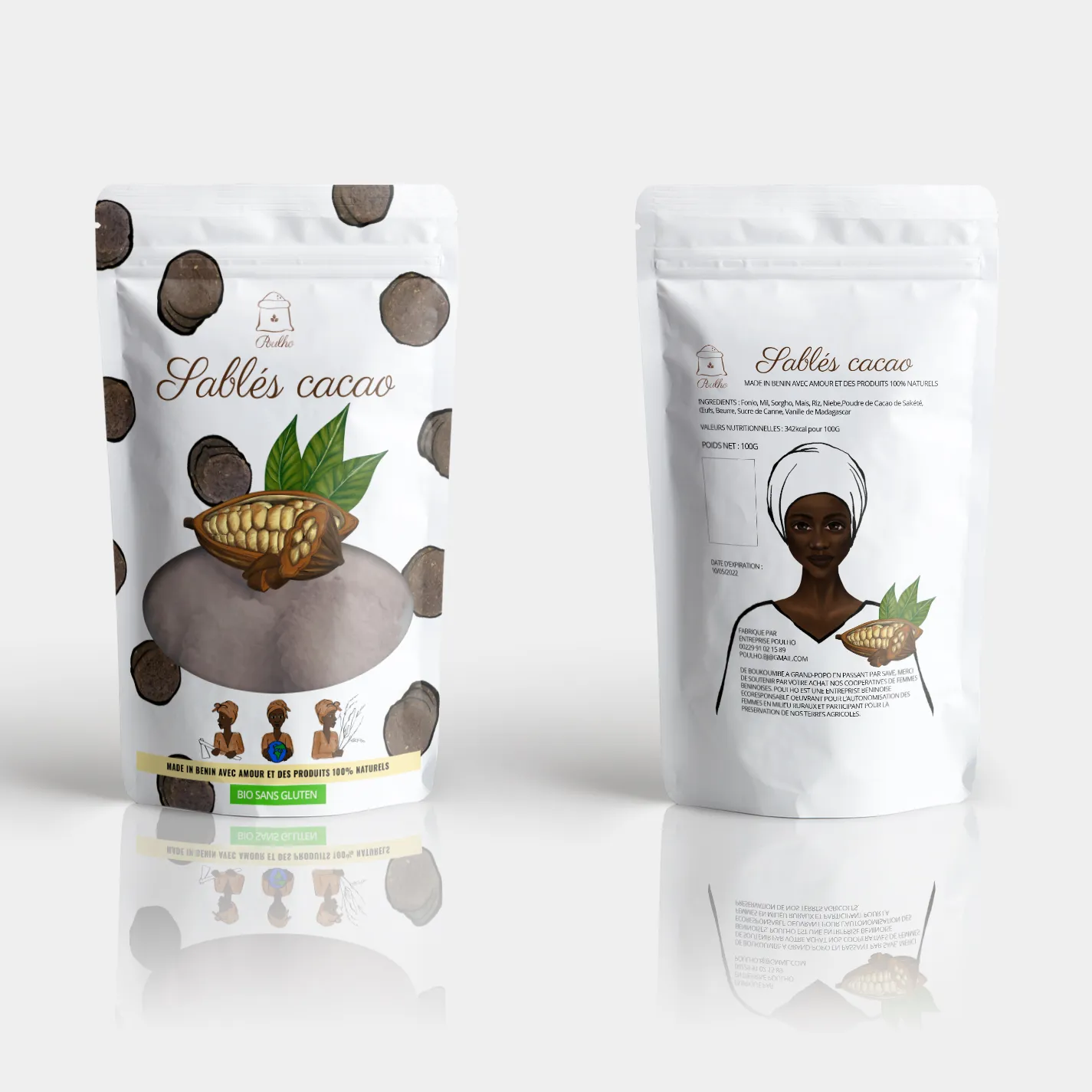
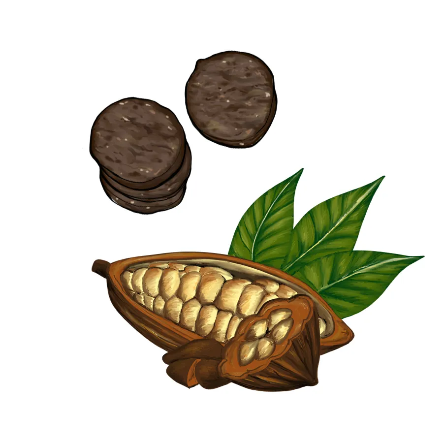


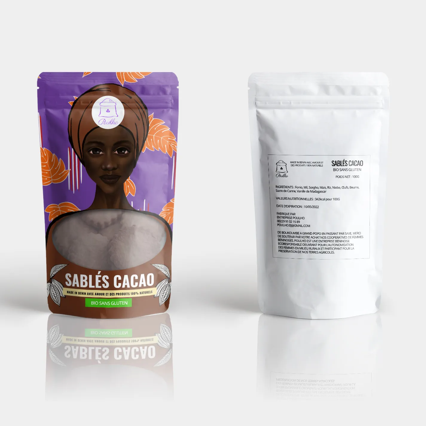
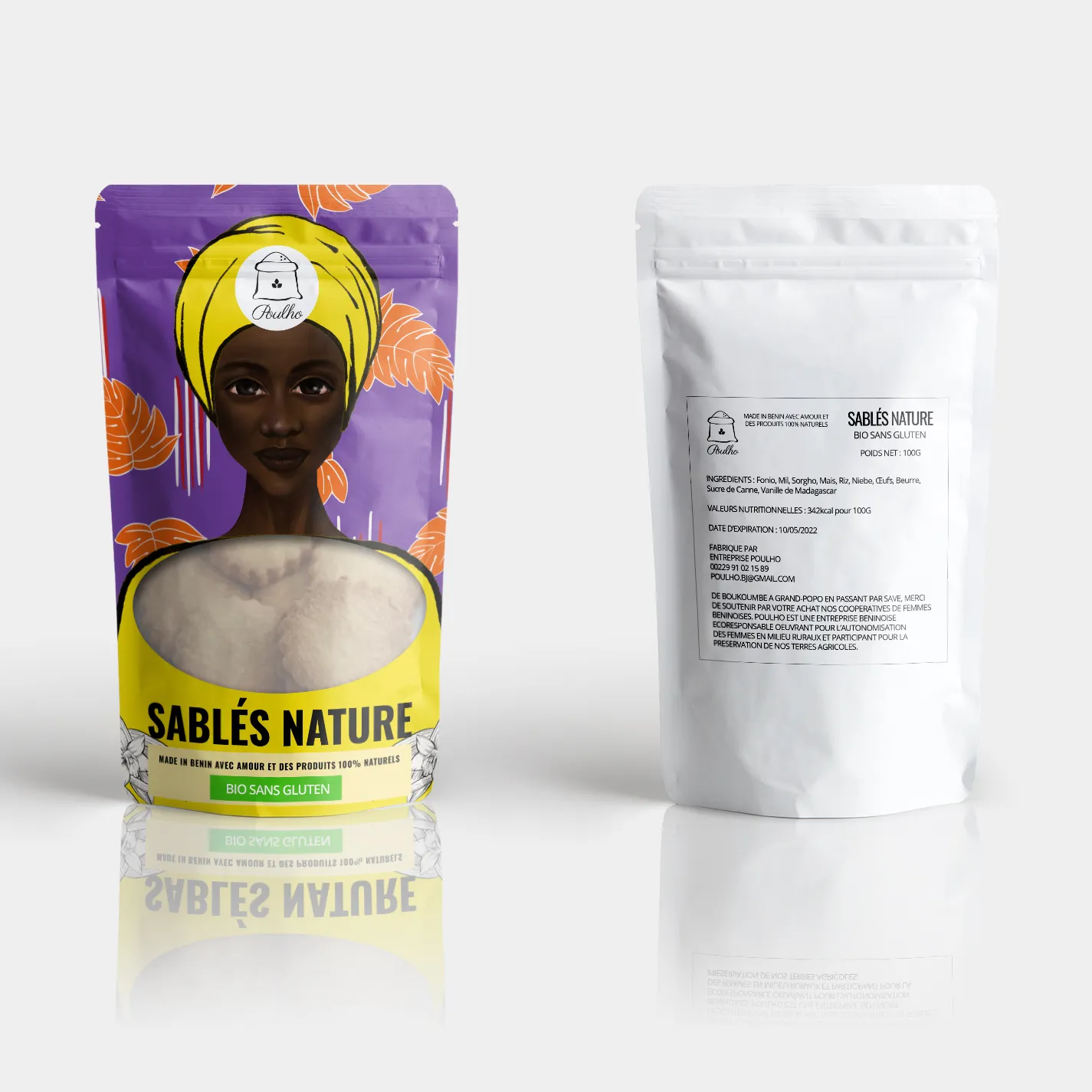
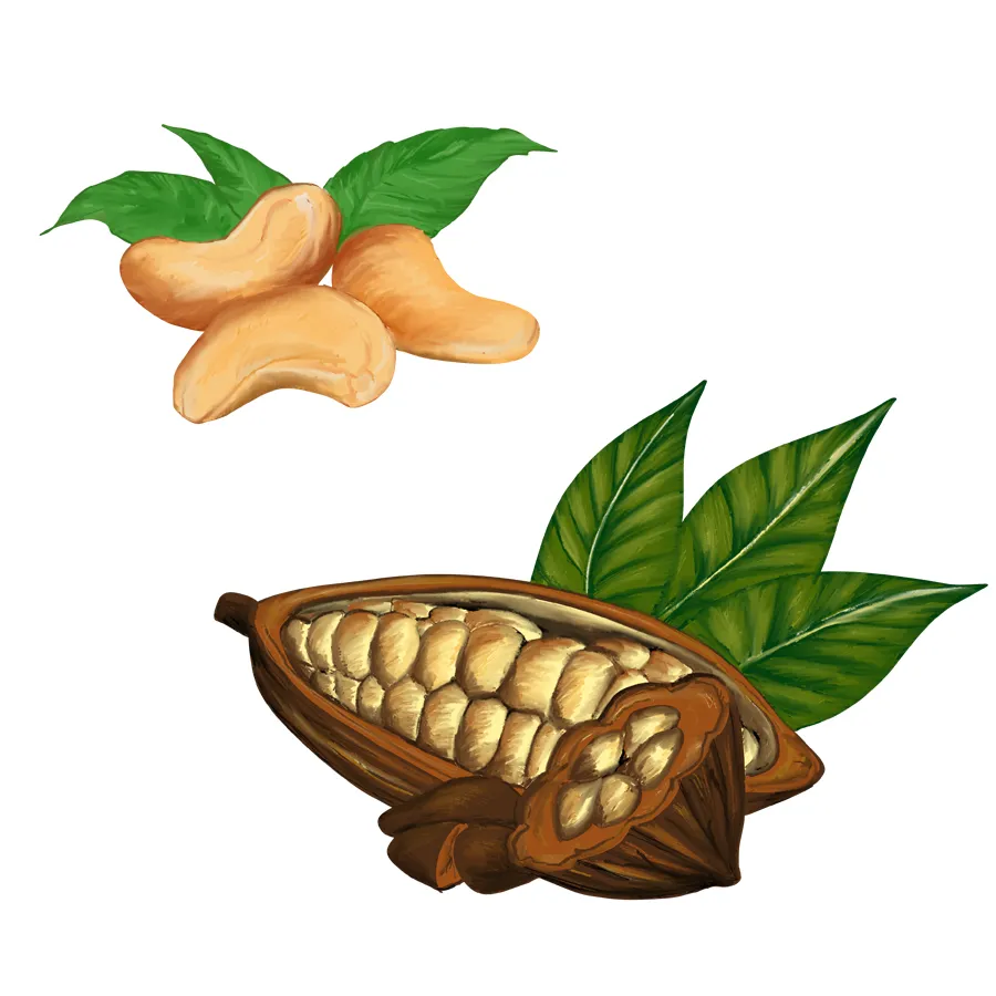
From that inquiry, I developed a direction that is joyful, bold, and feminine — not in a clichéd way, but as a form of strength and connection. The packaging highlights the ingredients as vibrant, hand-drawn illustrations, and the tone is friendly, empowering, and honest. It speaks of local knowledge, of colorful mornings, and of food that tells a story — a woman’s story.