
PREMISE
EASTPAK aims to develop a new purchasing concept that allows users to combine different colors and graphic design variations on a single product: Charlie Combo.
OBJECTIVE
To establish an art direction for this new concept through a collection of bags and a flexible, modular web page that can be adapted for future collections.
DELIVERABLES
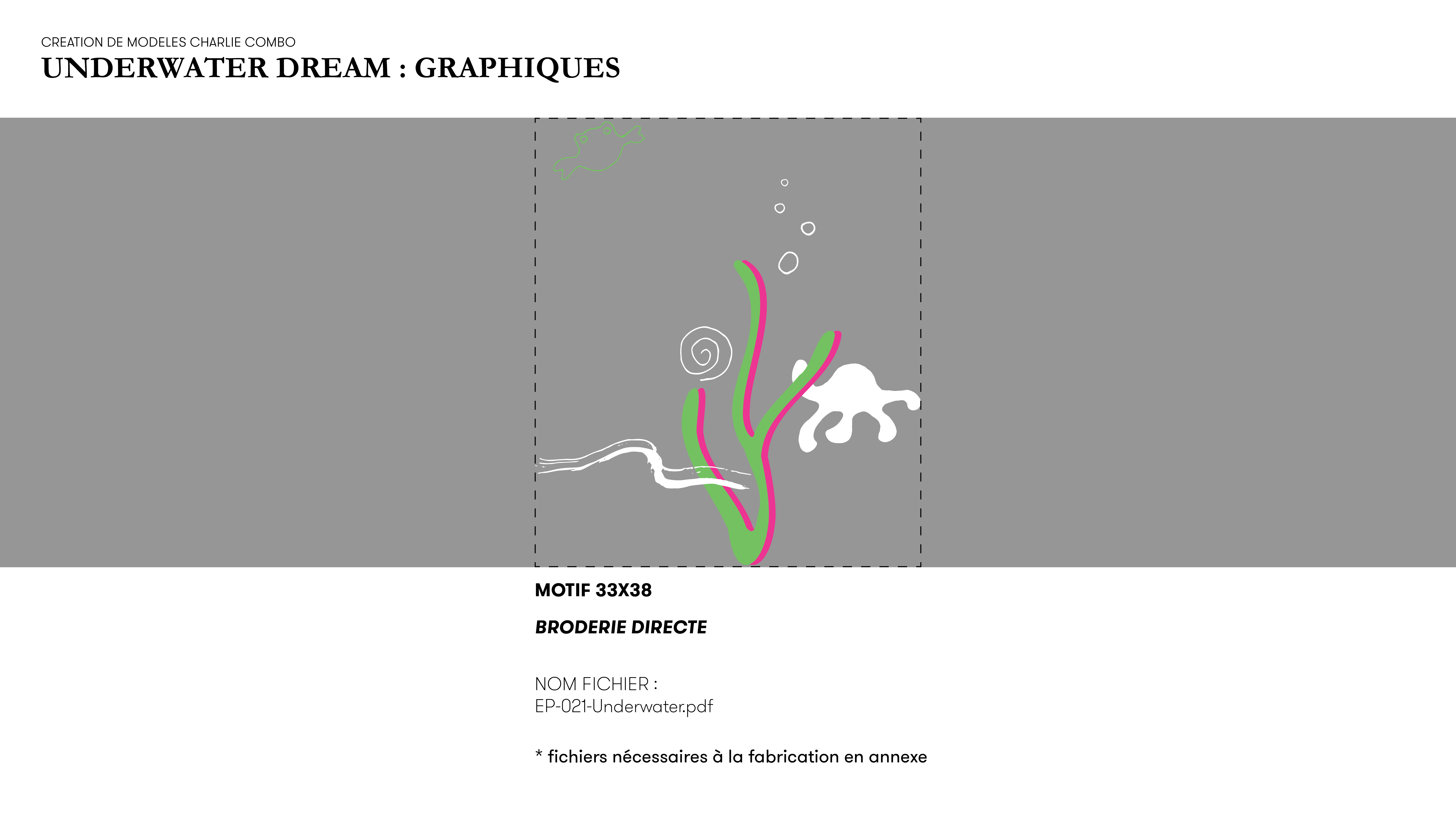
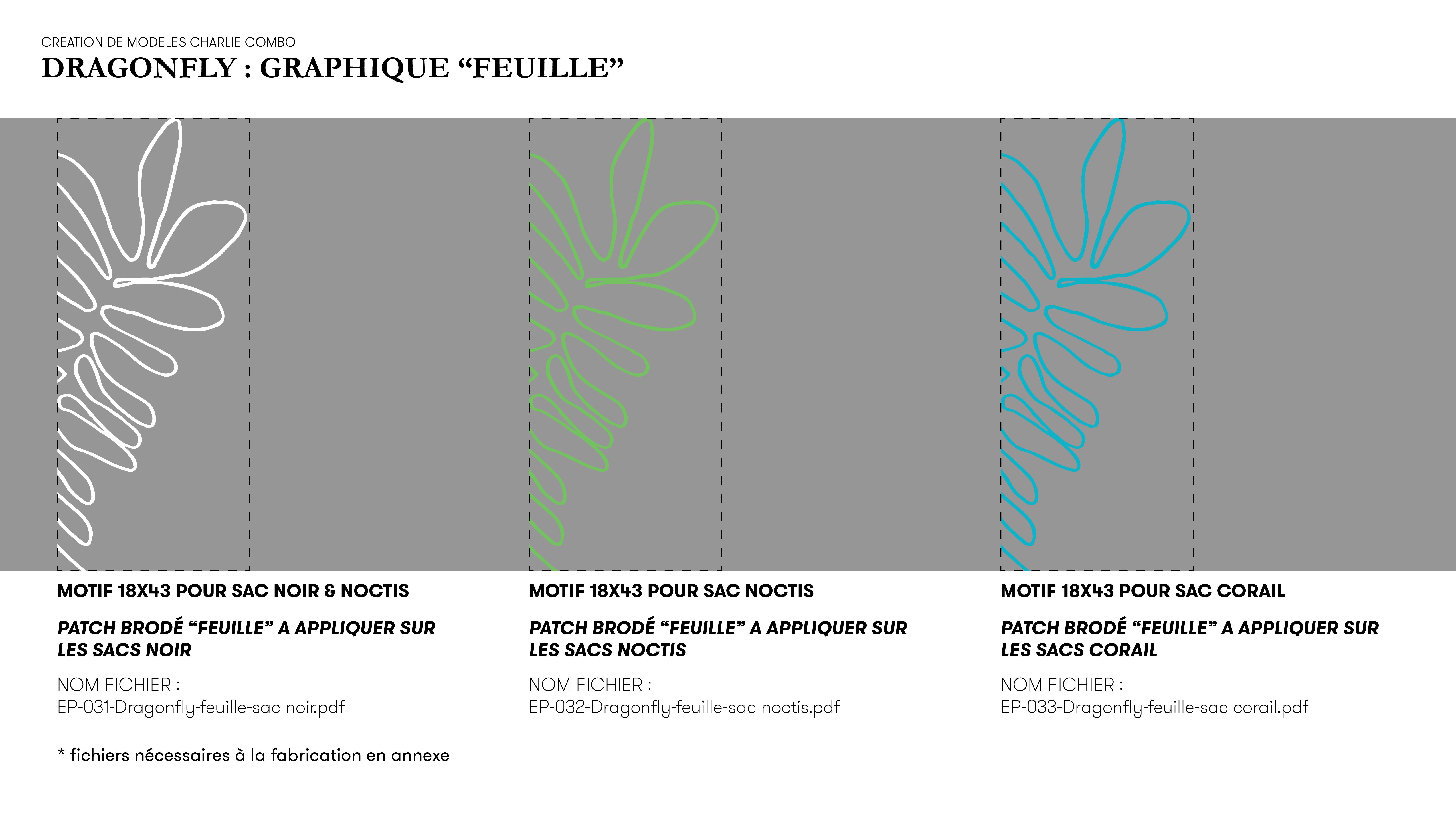
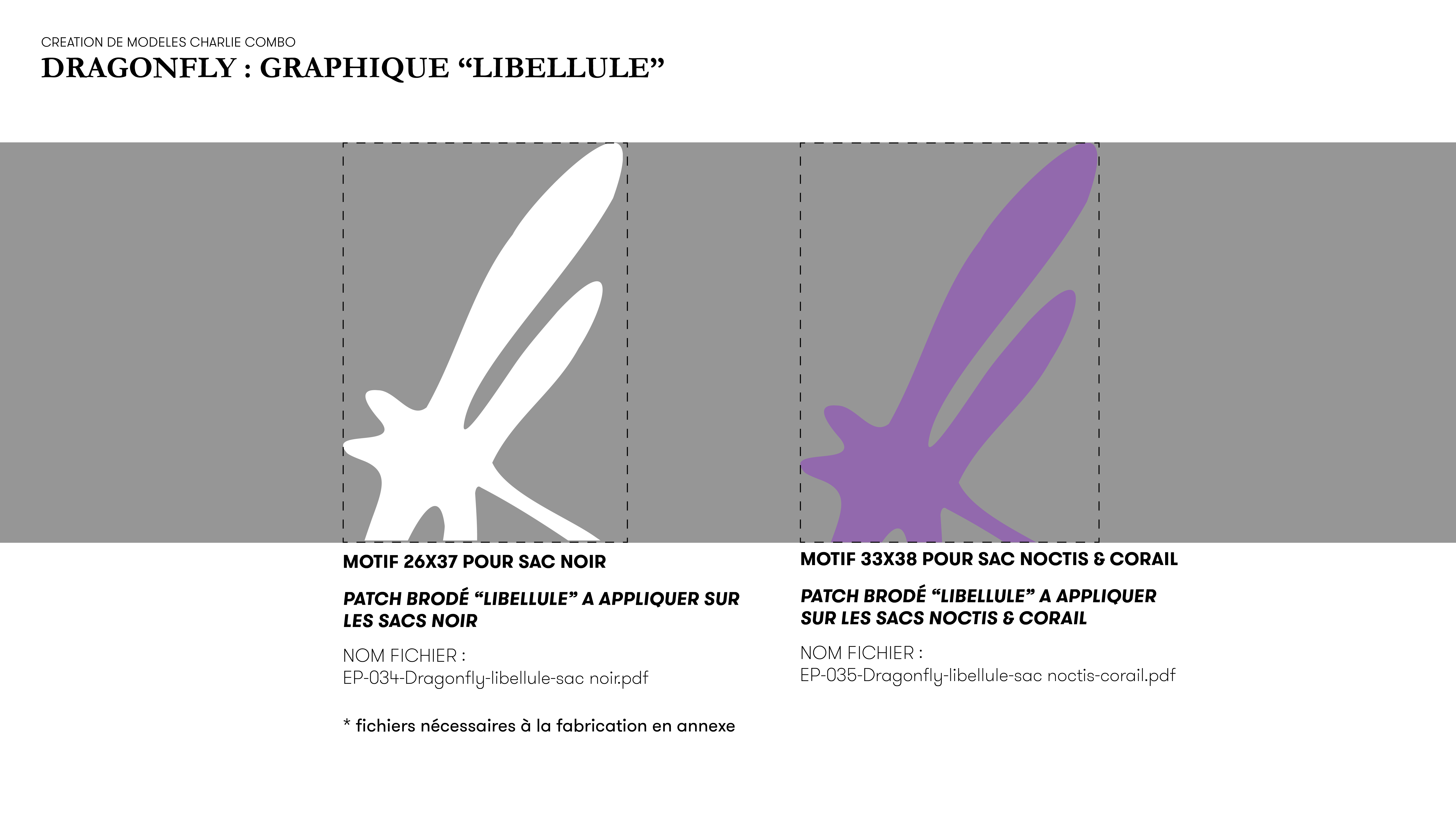
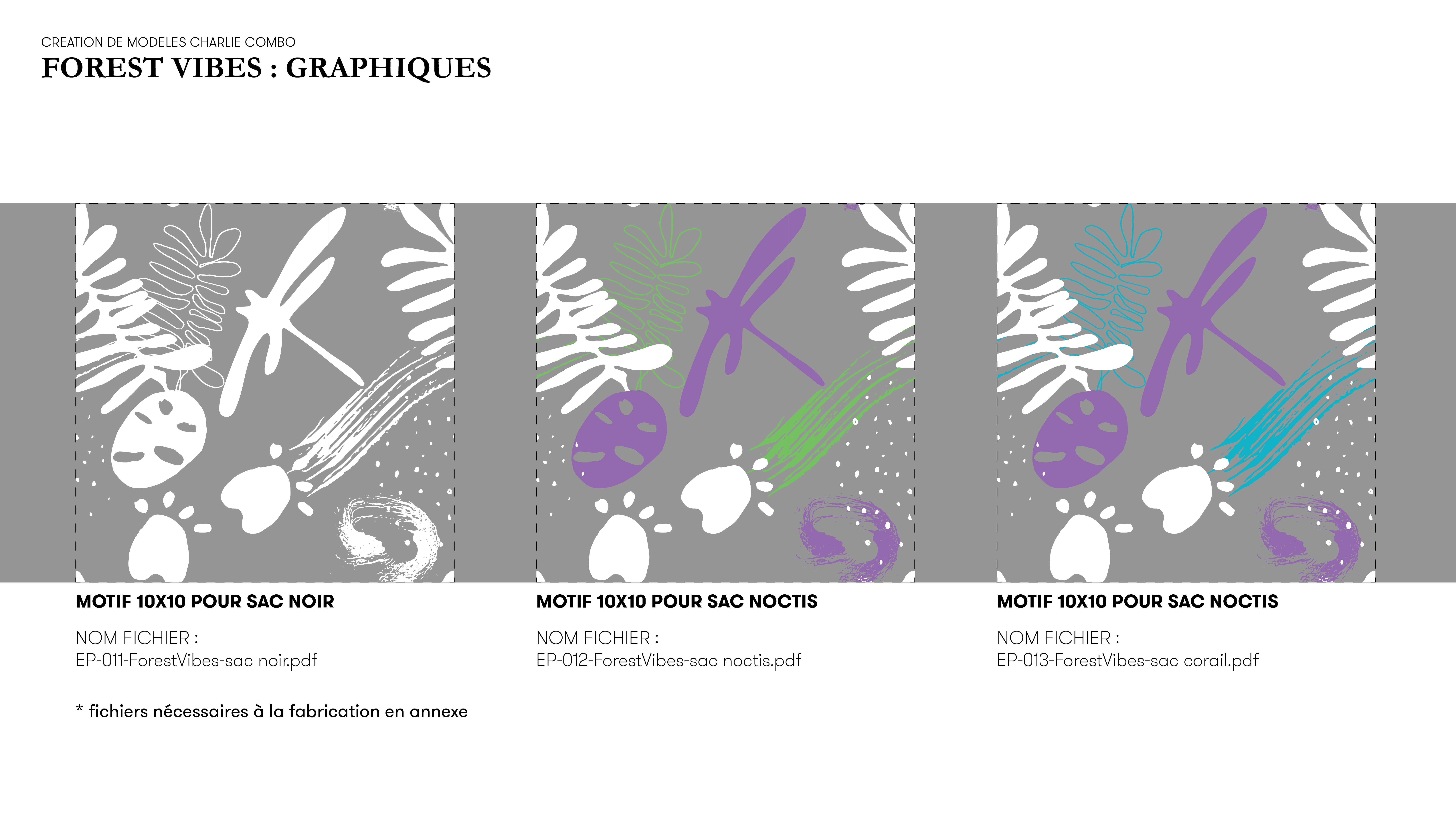
1. Three graphics (including one with an all-over pattern), applied to:
• 3 bag color variations
• 3 handle color variations
• 3 variations EASTPAK label color
→ Total: 3 × 3 × 3 = 27 bag combinations
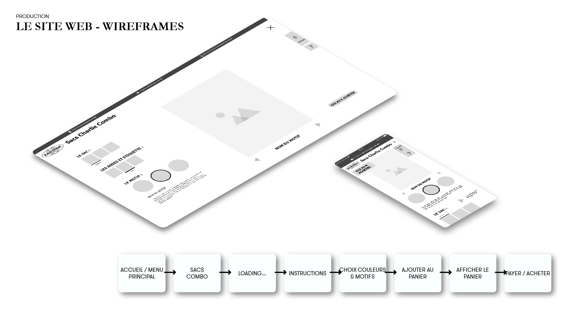
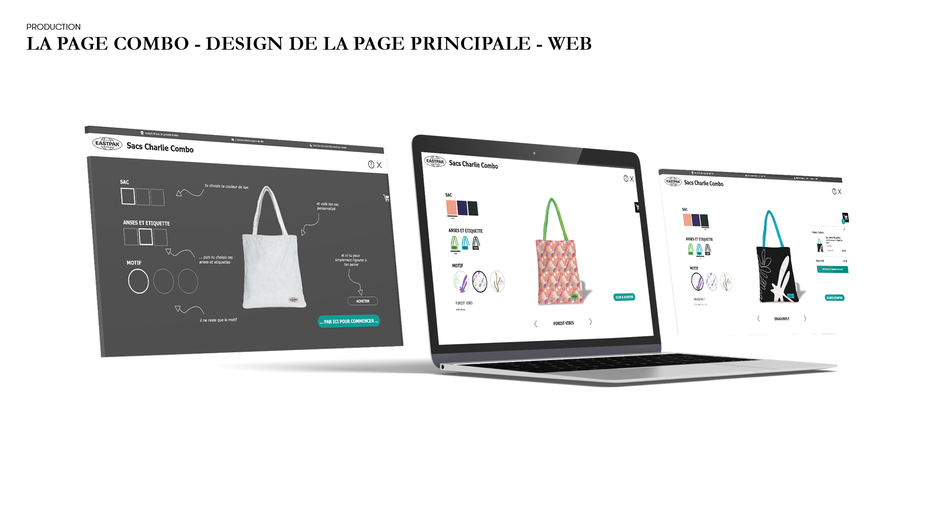
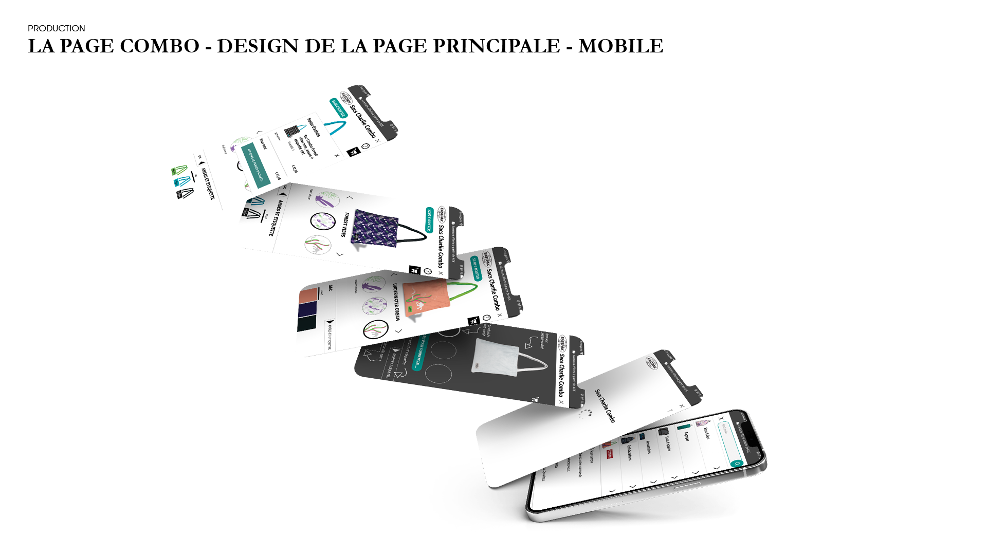
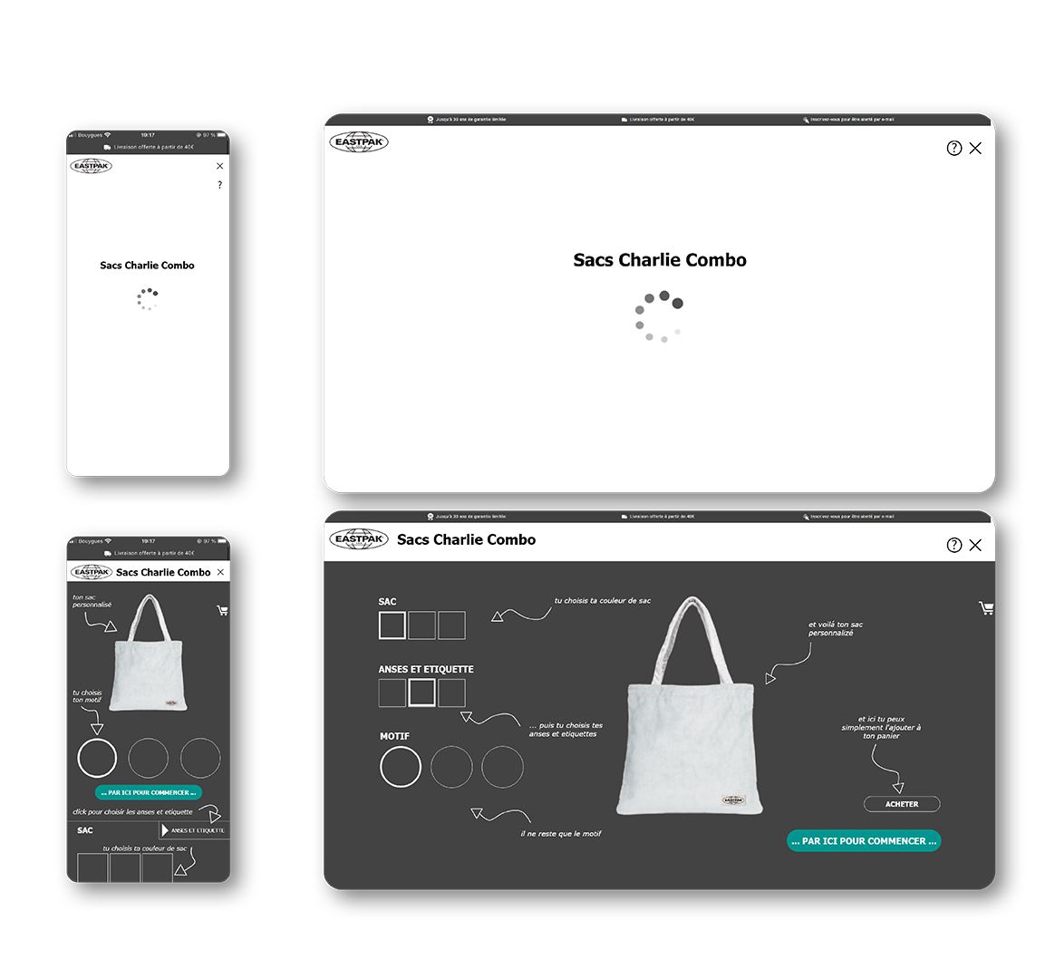
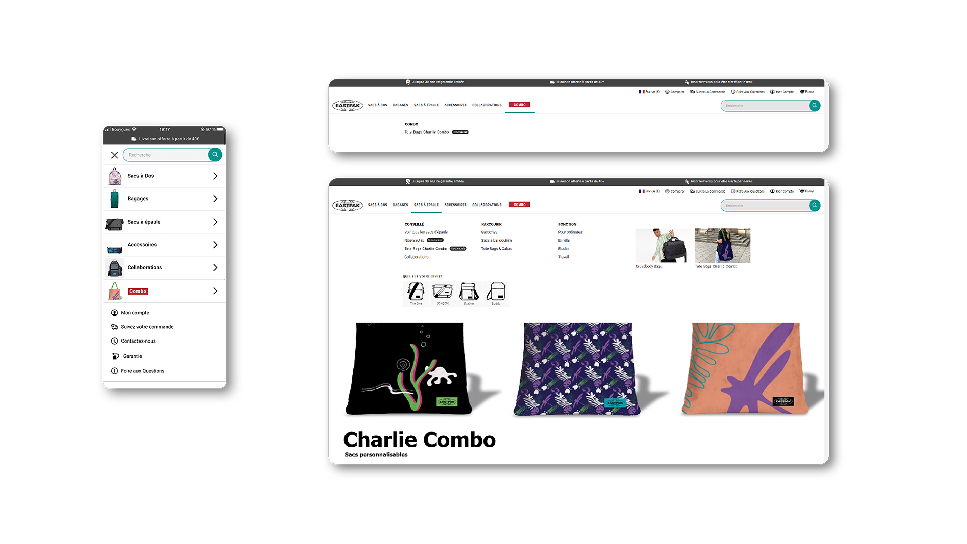
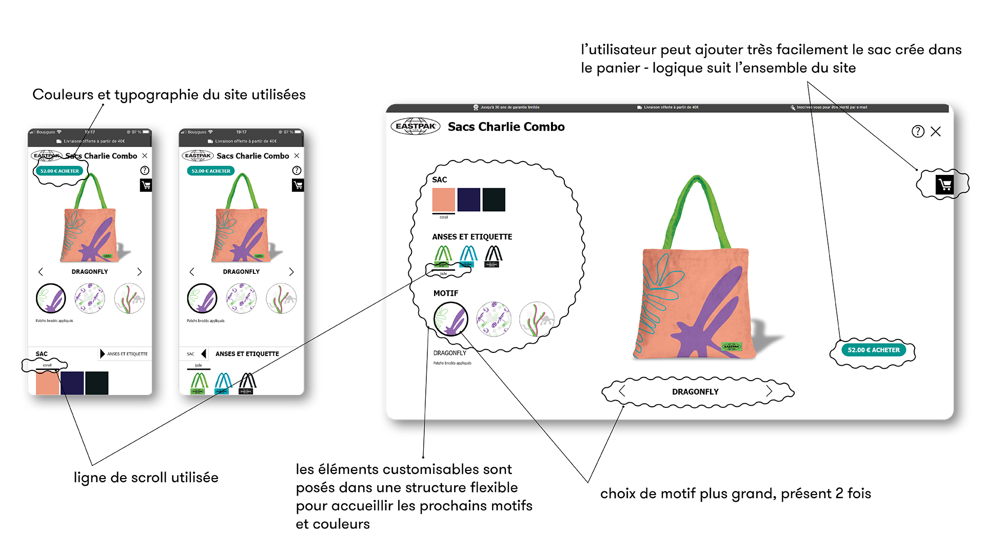
2. Product page (WEB + MOBILE)
A user interface that allows customers to customize their bag with all available options.
3. Promotional communication assets
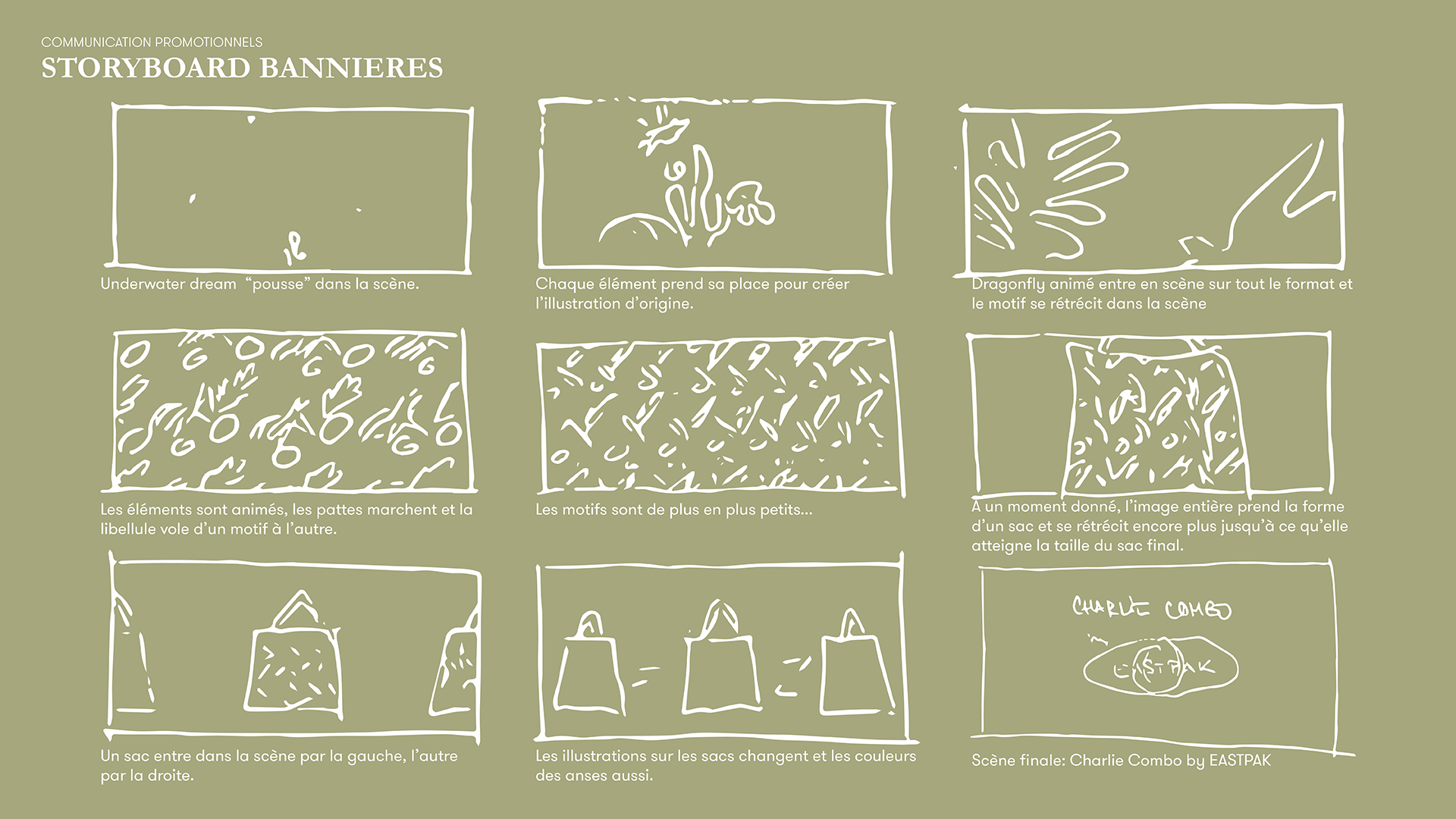
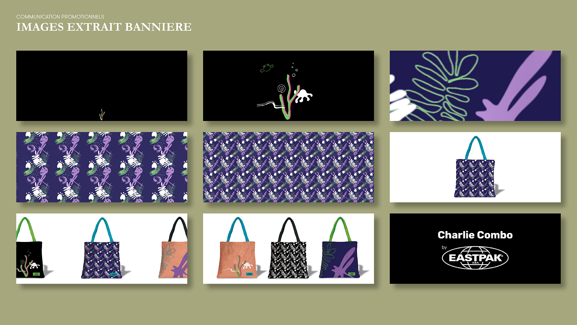
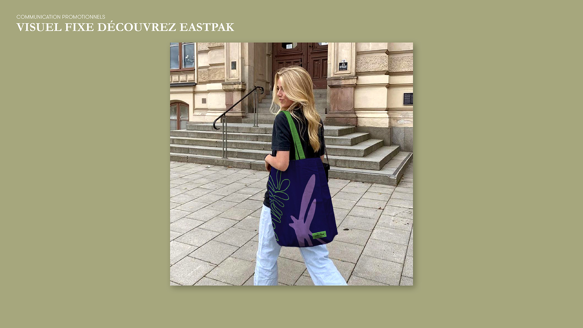
• Animated banner for the homepage header
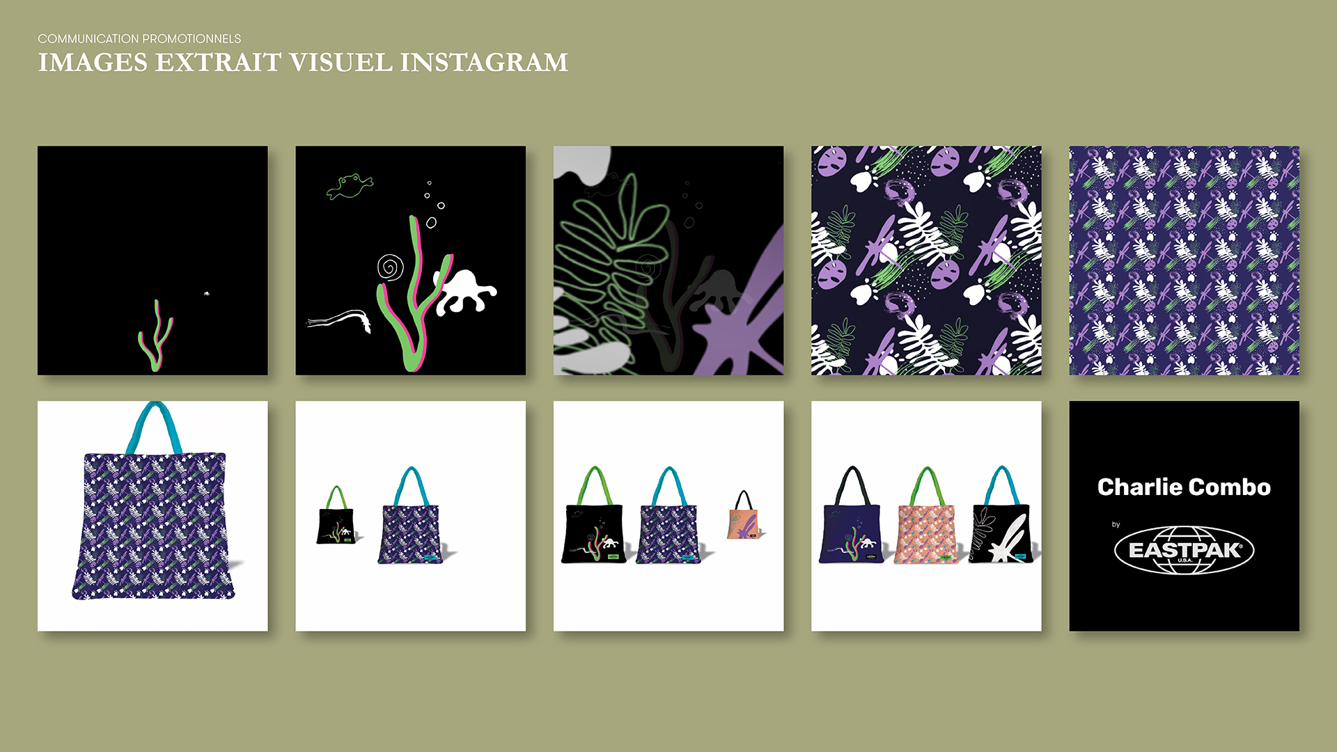
• Instagram visual
• Static visual for the homepage
EASTPAK is a globally recognized American brand known for its high-quality bags and luggage.
Founded in 1952 in Boston as a supplier for the U.S. military, the brand shifted its focus in 1976 to consumer products under the direction of Mark Gordon.
In 1985, EASTPAK pioneered the use of bright colors and graphic prints, embracing a bold, urban identity.
Popular in France since the 1990s, the brand was acquired by VF Corporation in 2000, joining names like Vans and The North Face.
Since 2003, EASTPAK has collaborated with renowned designers and global franchises — from Maison Margiela and Neil Barrett to Stranger Things and National Geographic — merging function with creativity for diverse audiences.
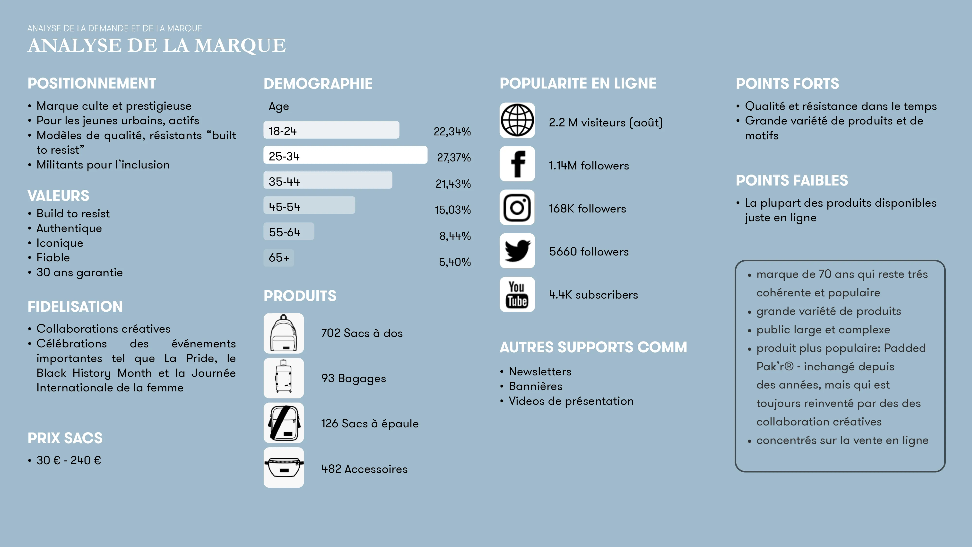

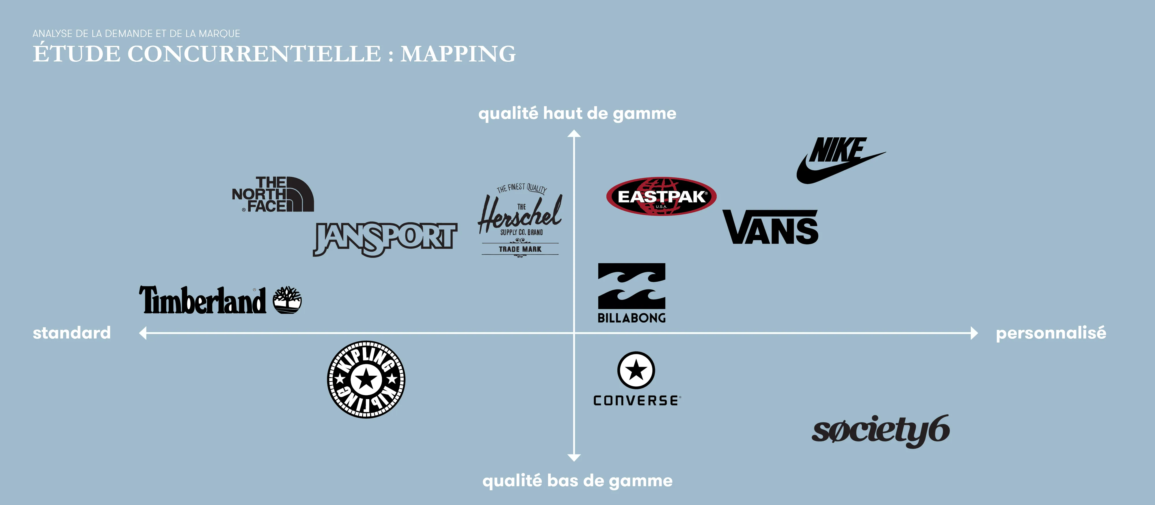
KEY TAKEAWAYS – BRAND & COMPETITIVE ANALYSIS
• Artist and brand collaborations are a strong strategic asset for EASTPAK. They widen the audience and give the brand a charismatic, friendly, and original personality.
• To build loyalty, it’s essential to involve users in the brand experience. The proposed concept — Charlie Combo — aims to do just that.
BENCHMARK INSIGHTS
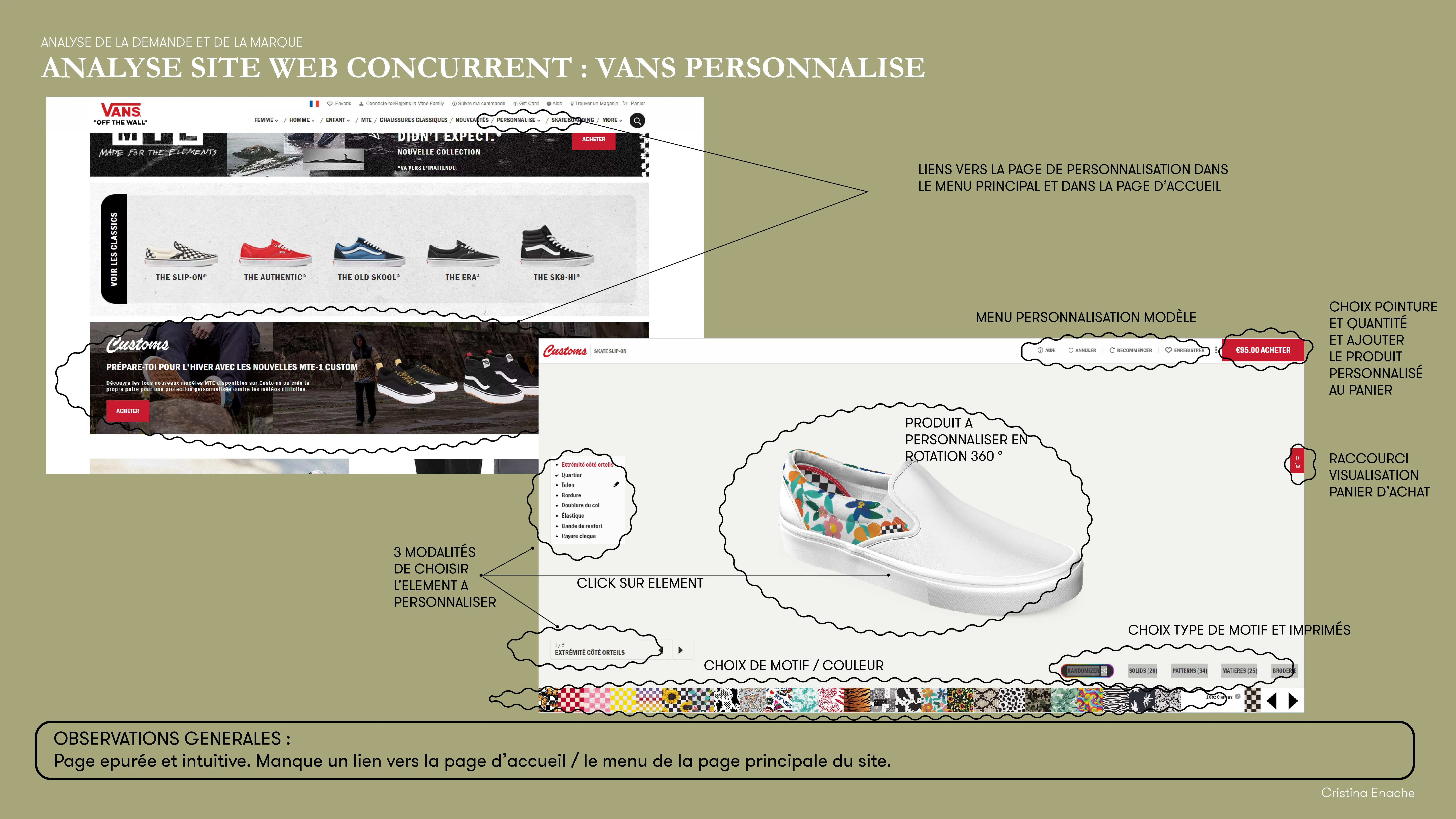
• Customization concepts already exist at major competitors (e.g. Nike ID, Vans Custom) — but mostly in the footwear segment.
• Platforms like Society6 also offer wide customization, though they focus more on printed design variety than product performance or durability.
UX OBSERVATIONS
• User participation should be reflected not only in the product but throughout the entire purchase journey — from discovery to delivery.
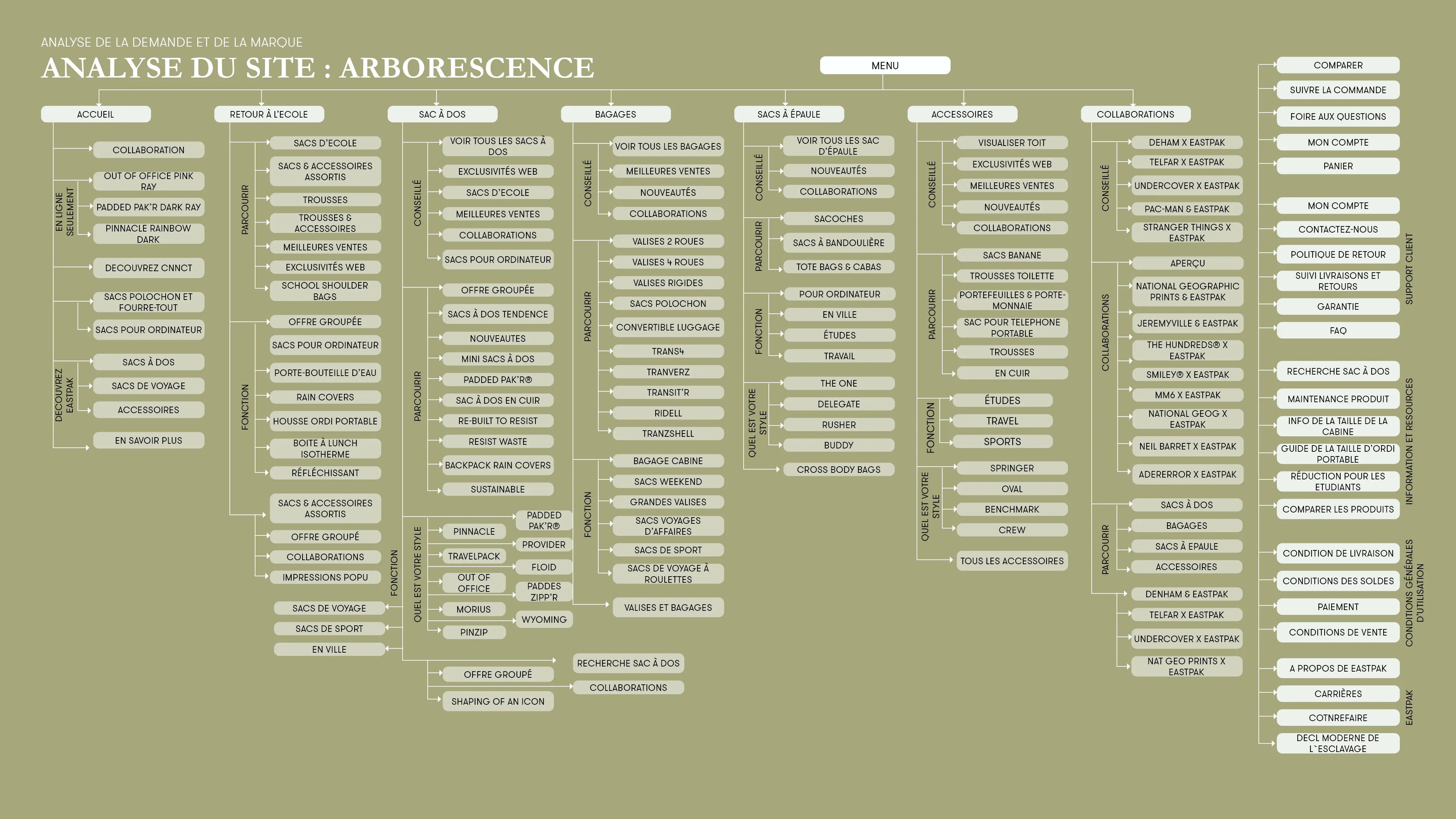
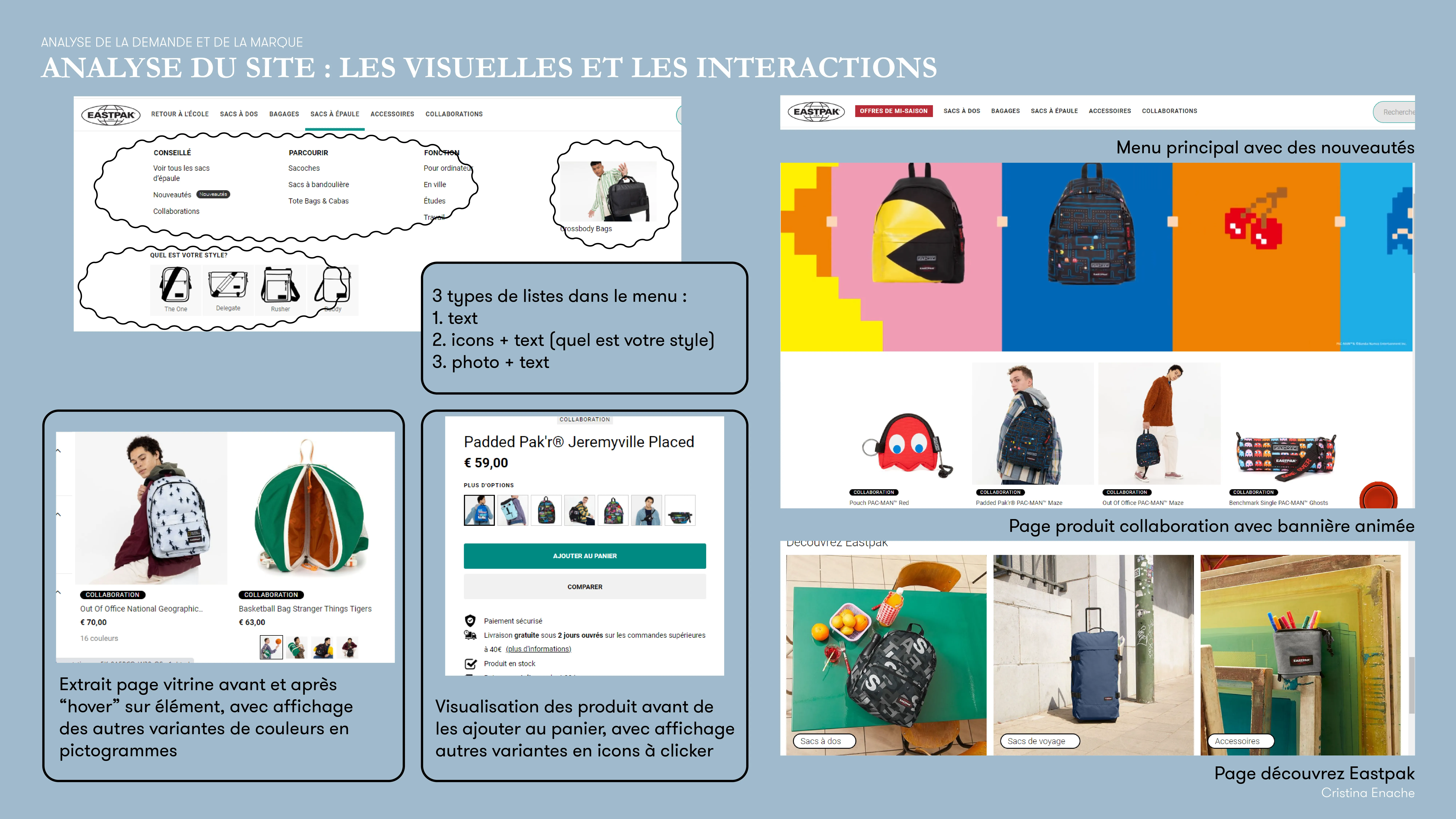
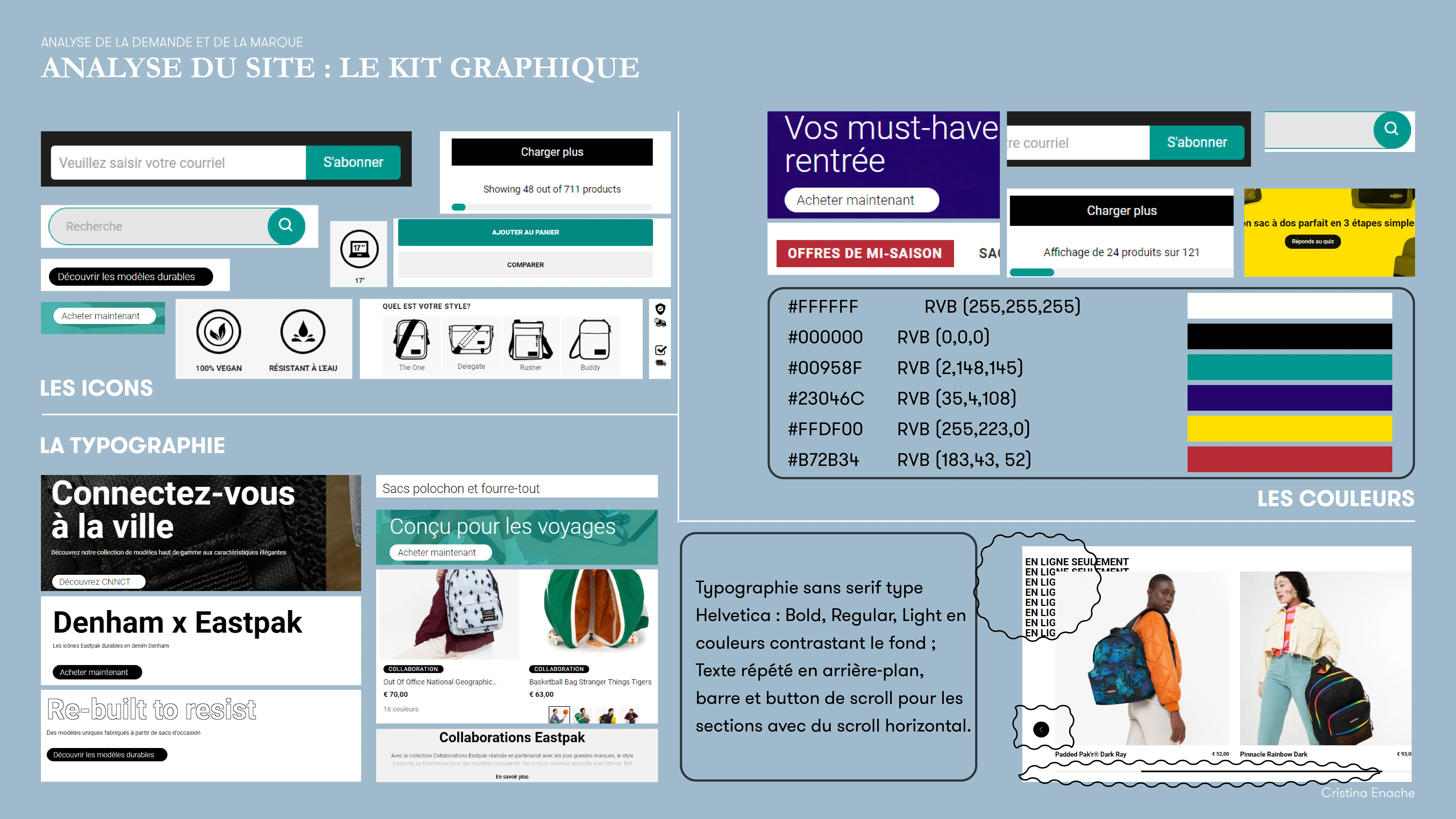
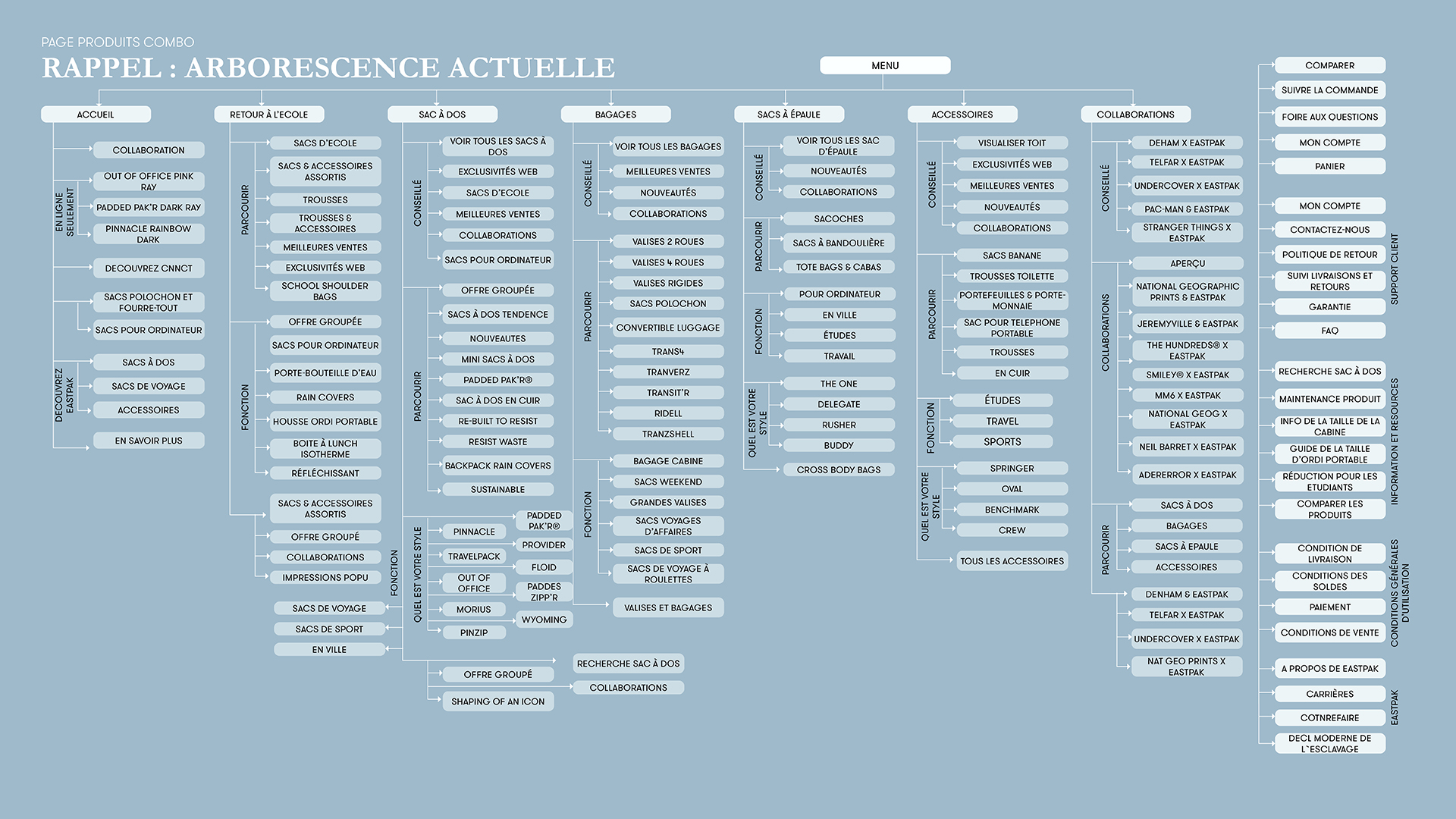
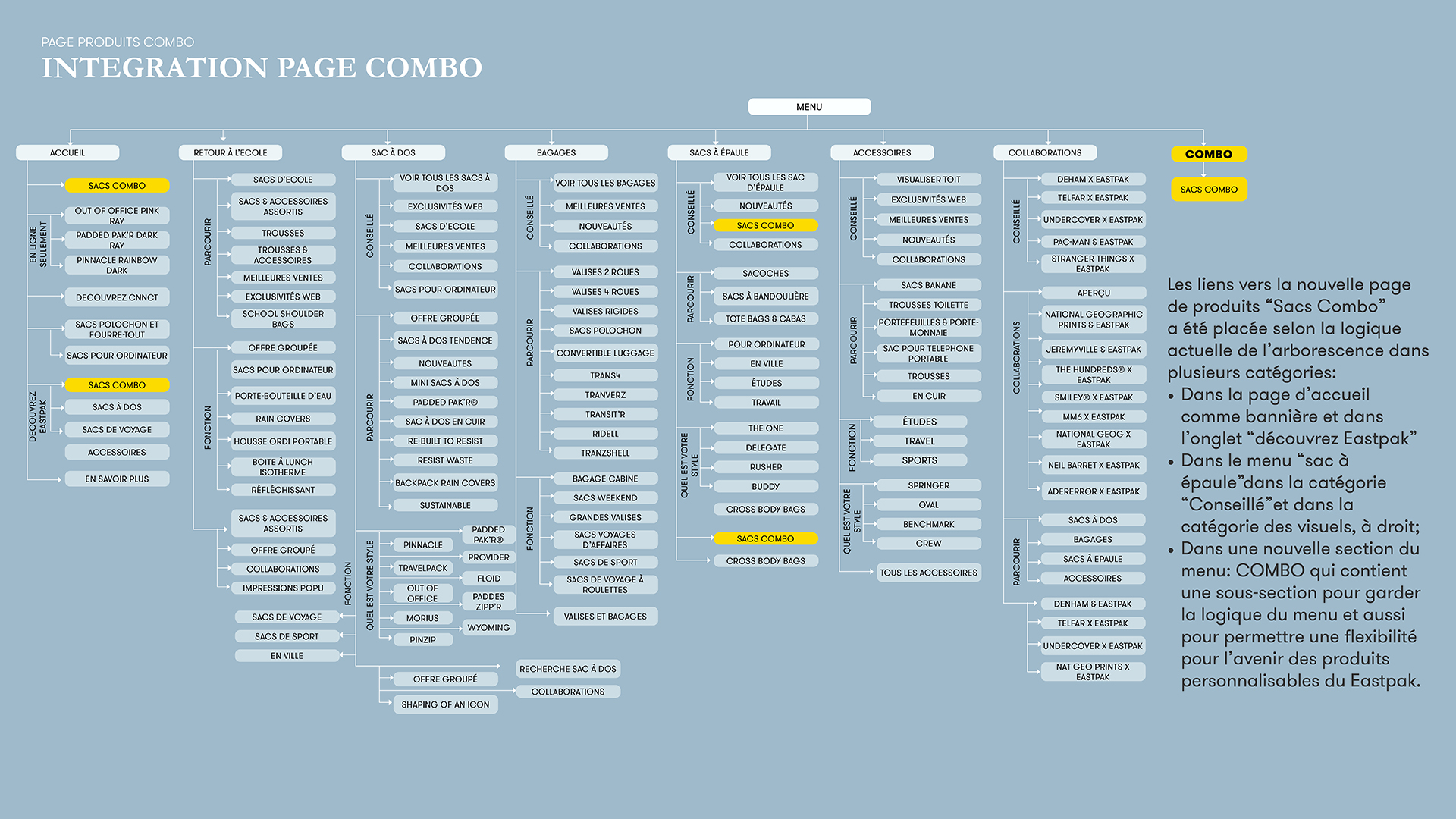
• On EASTPAK's current site:
- The navigation menu is complex, with overlapping categories and multiple paths to similar results.
- The homepage and “Discover Eastpak” sections lack visual hierarchy, making elements compete for attention.
FOOD FOR THOUGHT
How can the new product be visibly featured on the homepage without disrupting the overall experience?
• Where should it be integrated within the navigation menu for optimal visibility and UX?
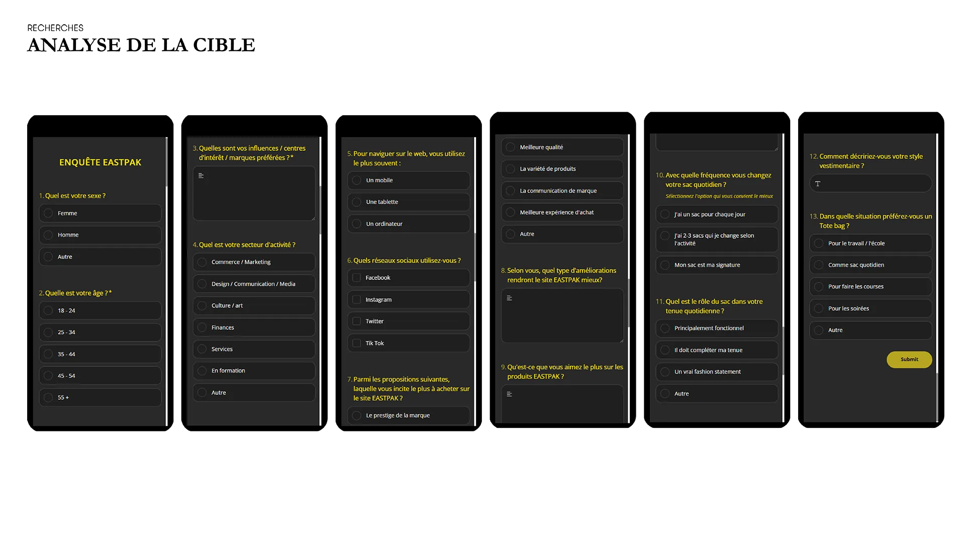
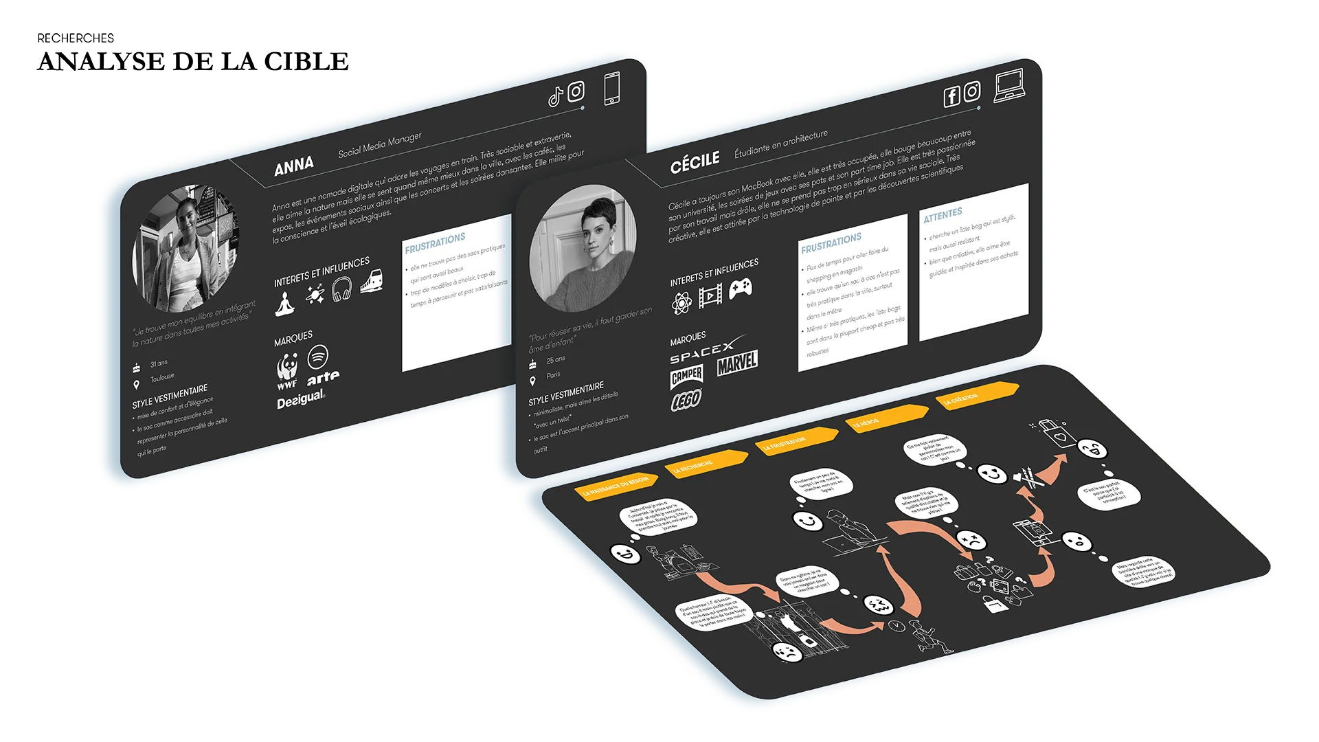
KEY INSIGHTS – TARGET AUDIENCE
Profile: Urban nomad, 20–33 y.o., mostly women, educated, higher income, city-based, socially active, mobile (scooter, metro, bike).
Mindset: Curious, creative, drawn to both city life and nature. Seeks originality, values meaningful, guided experiences.
Style & Interests: Eclectic, understated. Cares about sustainability, wellness, travel, and culture with a tech twist.
Pain Points: Overwhelmed by choice, short on time.
Expectations: Desires curation and customization — wants to feel both guided and involved.
KEYWORDS
WHERE: In the city
WHAT: Nature, travel, sustainability, technology, healthy lifestyle, joy
HOW: Eclectic, minimal, organic, digital, trendy
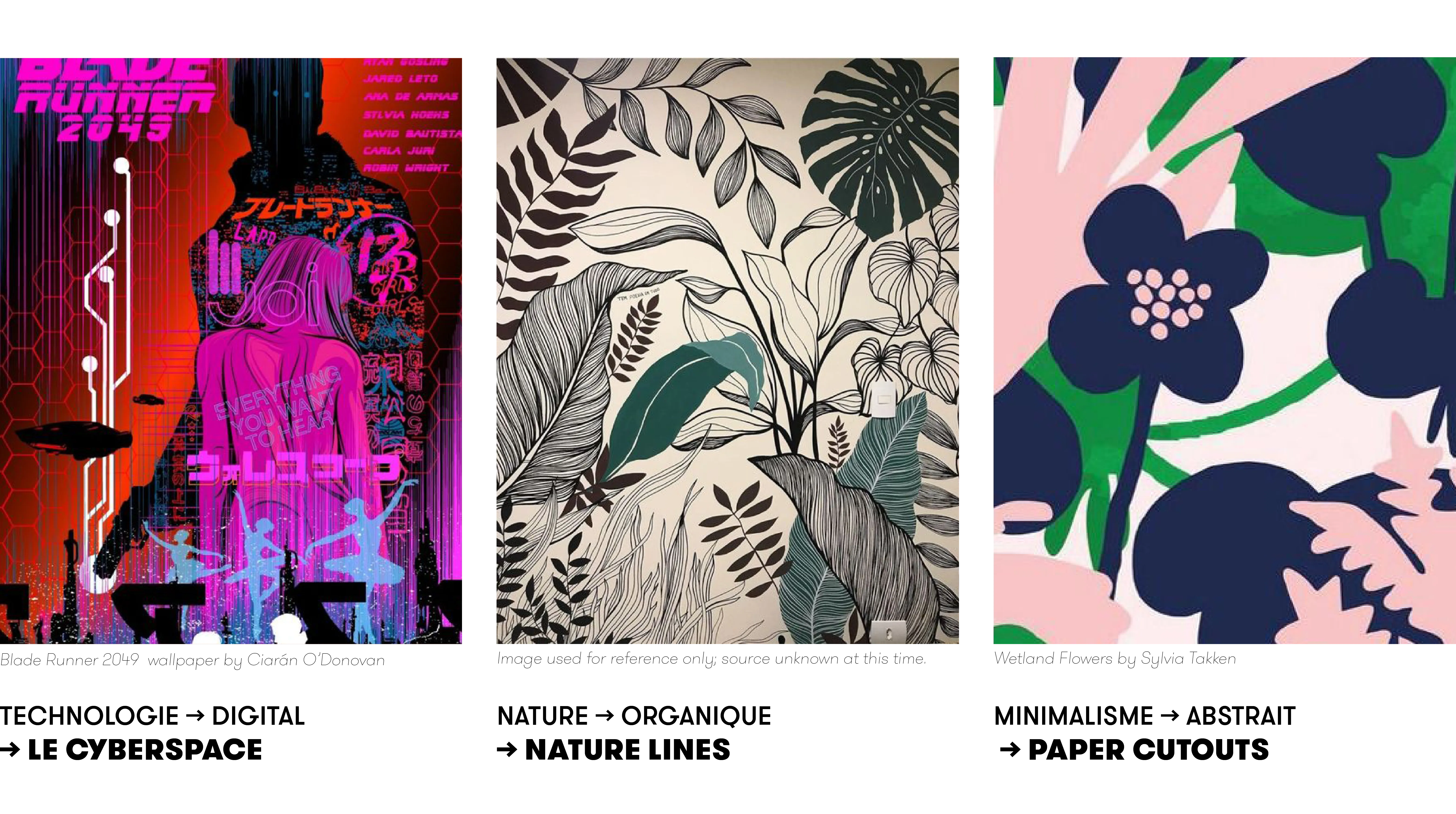
CREATIVE DIRECTIONS
1. Technology → Digital → CYBERSPACE
2. Nature → Organic → NATURE LINES
3. Minimalism → Abstract → PAPER CUTOUTS

MOODBOARDS FOR THE 3 DIRECTIONS:
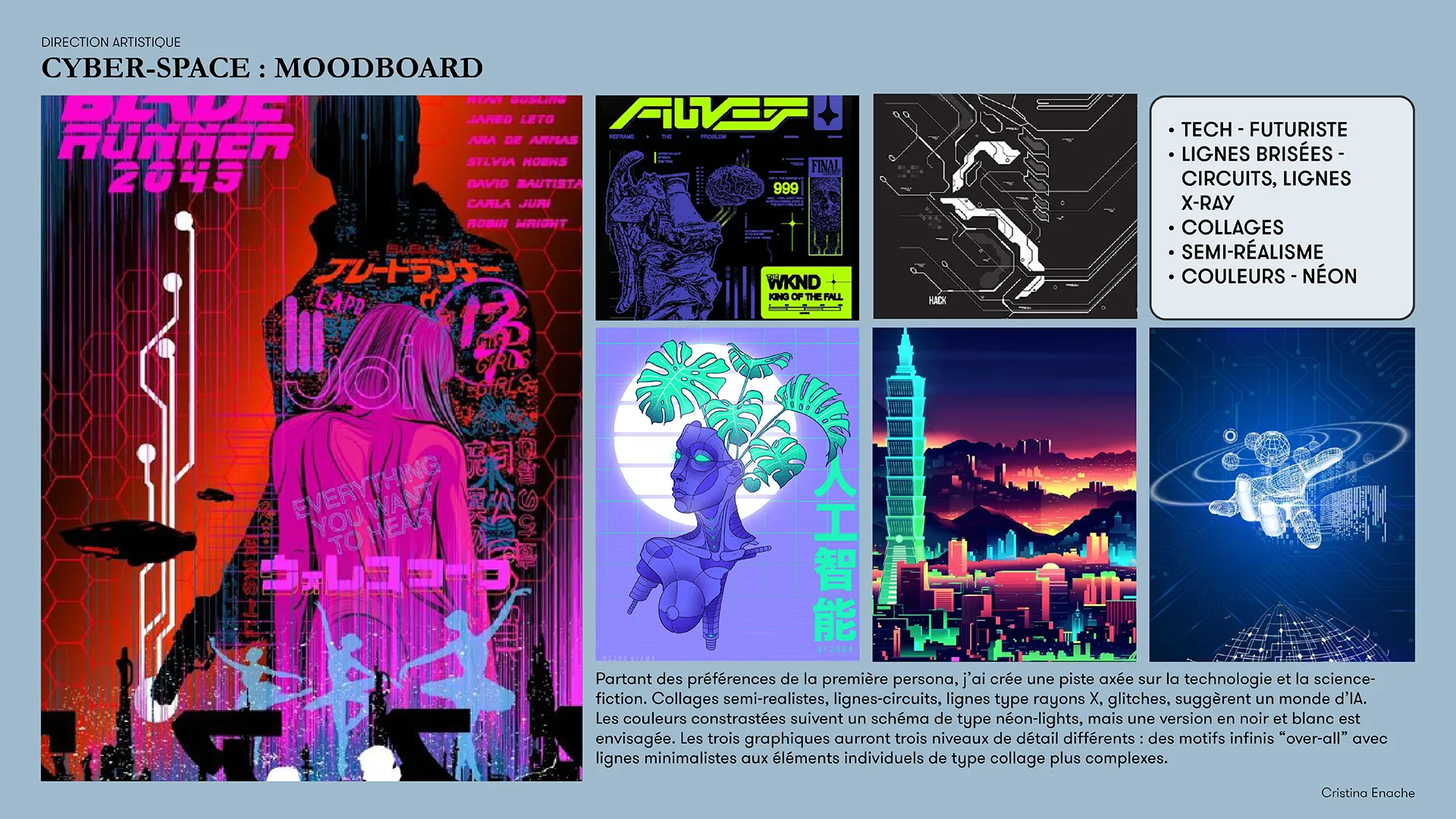
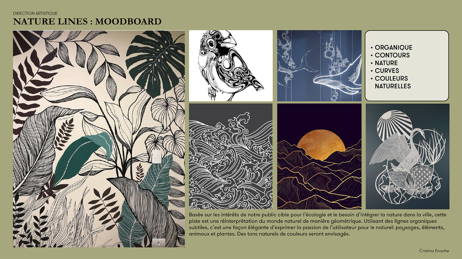
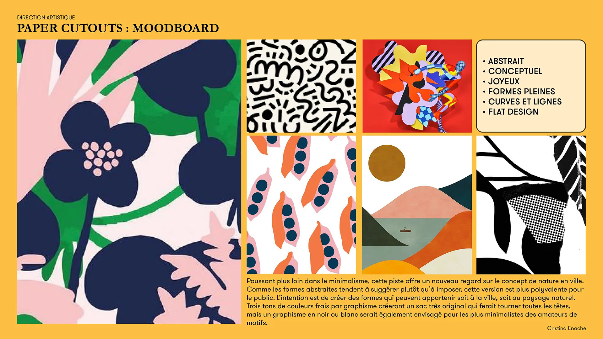
*These moodboards are curated collections of visual inspiration. Images belong to their original creators and are used here purely as part of a conceptual design process.

“Paper cutouts” is an abstract and minimalist concept — yet the most layered one — blending themes of nature and travel with a digital aesthetic. It draws on neon tones inspired by technology and the city, creating a visual language that bridges the organic and the synthetic.
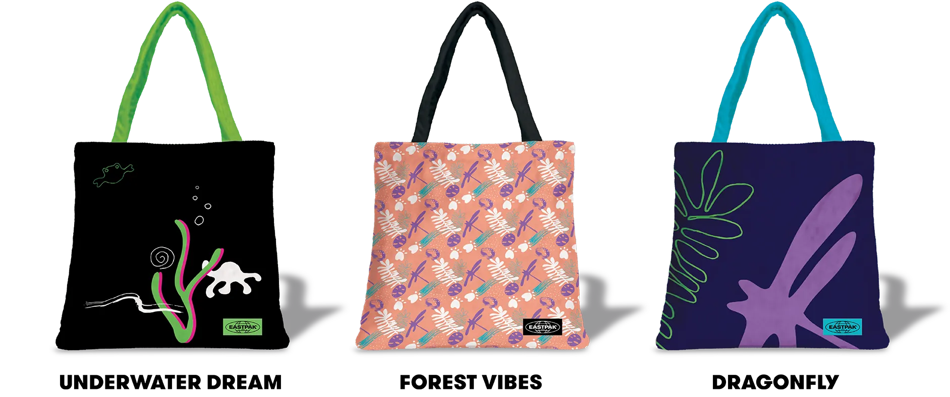
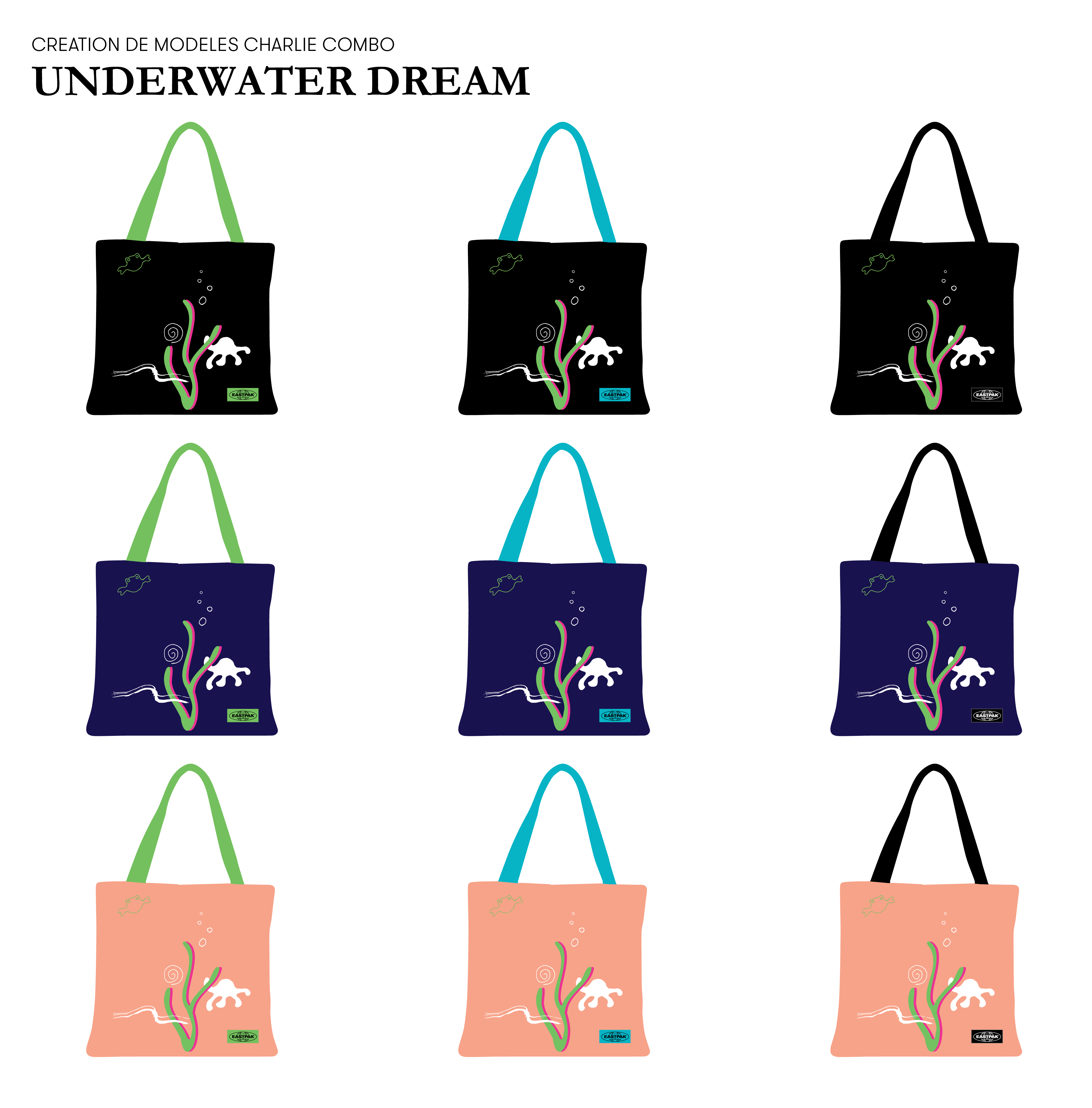
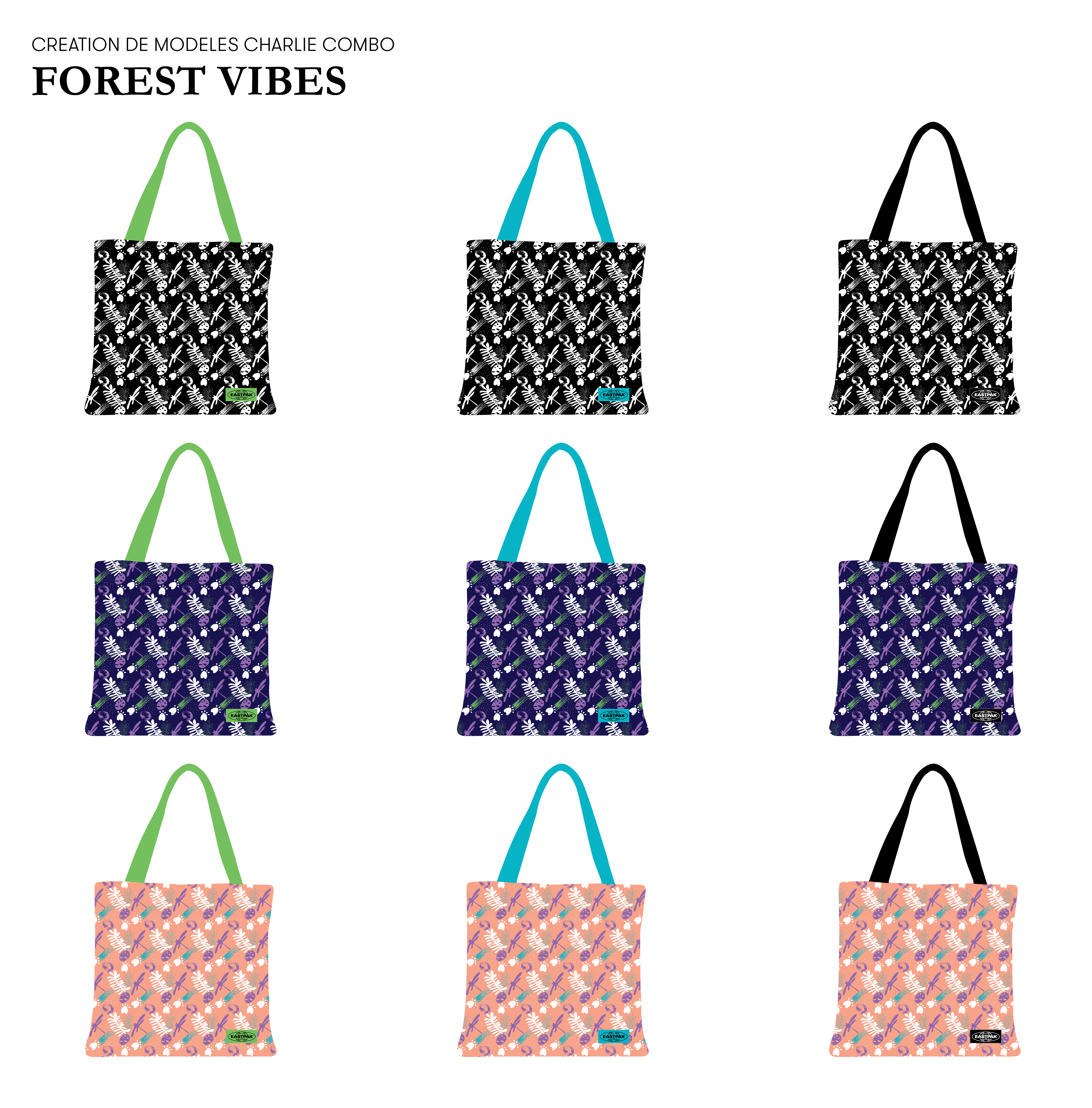
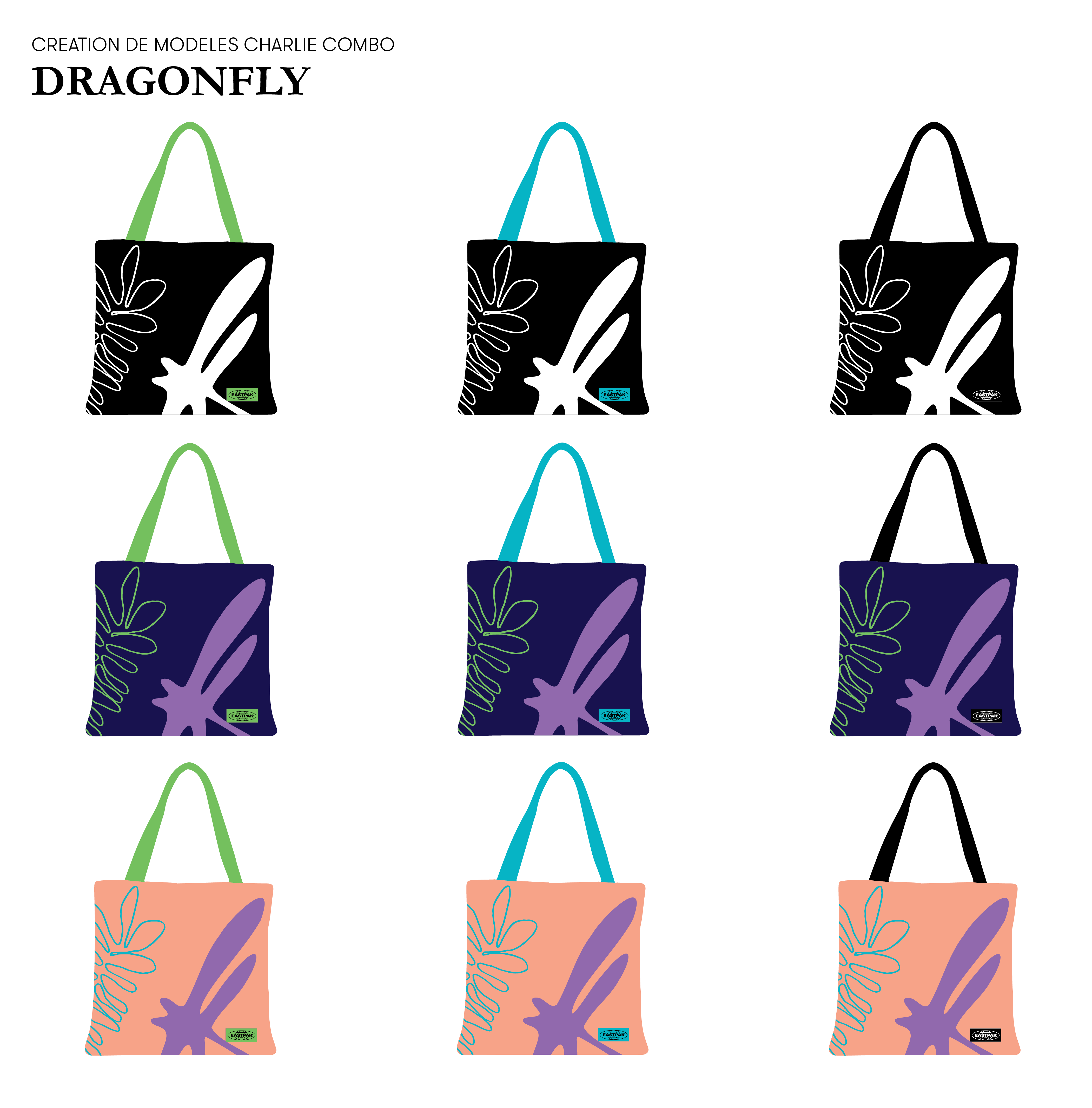
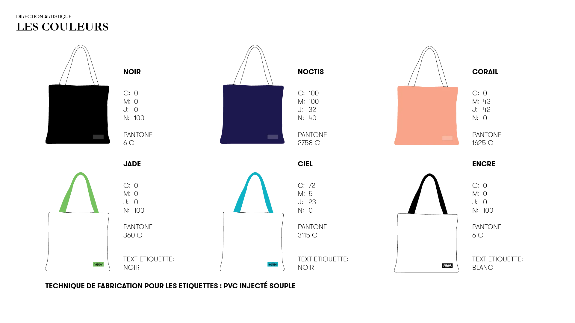
Base Colors for the Bags
Black – for those who prefer a classic, understated look that fits into any city setting. A safe, reliable choice for minimalist, practical users.
Coral – a playful, feminine touch that speaks to creativity and individuality, echoing the user’s desire to stand out and feel unique.
Noctis Blue – a deep, muted tone evoking nighttime cityscapes — modern, sophisticated, and perfectly aligned with an urban lifestyle.

FUNCTIONALITY OVERVIEW
LOADING PAGE
Onboarding – Instruction screen
Help
Bag photomontage preview
SELECTION LISTS:
Bag color selection (with color names)
Handle & label color selection (with color names)
Pattern selection (with name + printing technique description)
Display model name
Display price
Add to cart
View cart